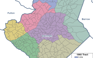
Tracking Census Tracts
We take a close look at the past and present of census tracts, a key reporting unit for Census data--and critical geography for figuring out (along with those data) eligible areas for grant funding.

We take a close look at the past and present of census tracts, a key reporting unit for Census data--and critical geography for figuring out (along with those data) eligible areas for grant funding.
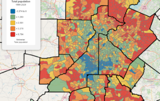
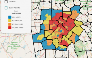
Taking a closer look at thirty years of neighborhood population growth, decade by decade!
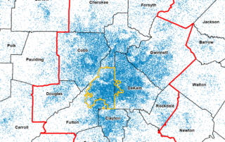
With schools considering a return to remote learning to prevent omicron surges among students and faculties, it's again worth a look at which communities are best positioned to handle quick switches and where we see the largest shares of school-age children.
An animated map showing how our diverse population has grown and moved over time.
An animation showing population growth at the Census tract level over the past 30 years illustrates where and how we've grown since 1990.
Our 2021 celebration of Hispanic culture in the 11-county metro continues with a look at the country of origin for our Hispanic residents.
This month (September 15-October 15) is Hispanic Heritage Month. We have a commemorative compendium of the latest data on this core growth component of our region's population. Installment 1 of 3 is current population trends!
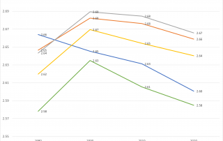
Population growth is declining recently, but what's happening to household size? Well, a little bit of everything, depending on where you look
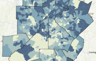
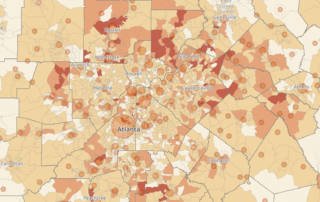
Insights on demographic changes at the tract and city level, along with an interactive map allowing you to explore more.
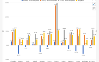
The U.S. Census just released its 2020 results. Here's a look at some initial insights of our population and demographic change. Spoiler alert: We are continuing the trend toward more diversity.