
We all know that metro Atlanta is a fast-growing place. The larger MSA (MSA stands for Metropolitan Statistical Area for you non-data geeks out there) added 800,000 new residents over the past decade, which ranks it fourth in the nation, behind Dallas, New York and Houston. We’ve written about this growth, over time, in numerous places, including a post here. In this post, we’ll take this growth analysis one step further and pinpoint the fastest-growing neighborhoods over a 30-year period.
But first, indulge us in a little geek-speak. When the 2020 Census released its small-area counts late last year, we got busy processing that data in a way that allows us to look at population change over time in the same geographies (see the linked post above). This is a big deal because every 10 years, the Census re-draws small area geographies like census tracts, which breaks any chance of a time series analysis, unless you re-estimate the older decennial census counts–in the older geographies- into the current geographies to compare to the new counts. Well, we have done that, and we’ve loaded these data into DataNexus so you can play around with these data yourselves. But before you rush to that site (and you really need to check out DataNexus), take a look first at the analysis we put together below.
The map below (Figure 1) shows total population change between 1990 and 2020, where the reds and oranges represent areas (census tracts) that added the most new residents over this 30-year time period, and the blues represent areas that lost population. Although there are pockets of growth everywhere, the suburban areas in the 11-county Atlanta region experienced the largest growth.
Figure 1. Total Population Change 1990-2000
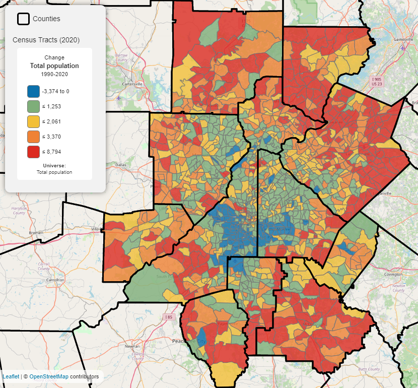
Source: U.S. Census; DataNexus
In fact, the top 20 census tracts for growth over this 30-year period are all located outside what we would consider the urban core, and are found mostly in Forsyth or Gwinnett Counties. In Figure 2 below, we see those census tracts that are in the upper 10 percent for total population growth between 1990 and 2020. Notice how these growth patterns are skewed to the north, particularly into Forsyth, Gwinnett and Cherokee Counties. The area with the largest growth, however, is the tract (1306.07) in unincorporated Forsyth that includes the Windermere Golf Club and Daves Creek Elementary School. This area added almost 9,000 new residents since 1990!
Figure 2. Top 10 Percent Census Tracts For Total Population Growth Between 1990-2020

Source: U.S. Census; accessed through DataNexus
While it is fascinating to visualize population change over thirty years, such an analysis does mask nuances to when during that period these areas experienced their growth spurts. So the next three maps (Figures 3 through 5) isolate growth trends by decade. They show how settlement patterns in the region have changed over time, and these changes ultimately reflect shifting priorities. For instance, Figure 3 below shows the top-growing tracts between 1990 and 2000. Similar to the arc of growth between 1990 and 2020, growth during the 1990s was concentrated in the northern parts of the region, but more so in Cherokee, Cobb, North Fulton and Gwinnett and less so in Forsyth. Also, growth in Henry County was just getting going during the 1990s.
Figure 3. Top 10 Percent Census Tracts For Total Population Growth Between 1990-2000

Source: U.S. Census; accessed through DataNexus
Let’s now look at the 2000s. Figure 4 below shows the same basic growth patterns as Figure 3, except growth in Fulton County shifted from the north to the south. This decade also saw growth shift from central/northern Gwinnett to southern/eastern Gwinnett. We see the same thing in Henry County as growth moves southward. Finally, we see growth in almost all of Forsyth picking up significantly compared to the 1990s.
Figure 4. Top 10 Percent Census Tracts For Total Population Growth Between 2000-2010

Source: U.S. Census; accessed through DataNexus
Finally, let’s take a look at the last decade (the 2010s). The picture is similar to growth patterns found in the 2000s, except below we see several areas in the City of Atlanta and the I-285 perimeter popping out for the first time in the time series. For the first time since the 1970s, the City of Atlanta added significant population during this decade, and this map reflects this growth renaissance. We also see growth occurring around the Woodstock area in Cherokee
Figure 5. Top 10 Percent Census Tracts For Total Population Growth Between 2010-2020

Source: U.S. Census; accessed through DataNexus
You can check these trends, and others, out yourself at our DataNexus mapping tool! Click the “Add Layer” button near the bottom of the left sidebar, and then add in the Census Tracts (2020) layer. From there, simply add the data in by searching for terms like “1990-2020 population” in the search window. We used the filtering function to highlight the growth areas that we talk about in this post.