
Monday Mapday
Maps showing themes and trends, published on Mondays

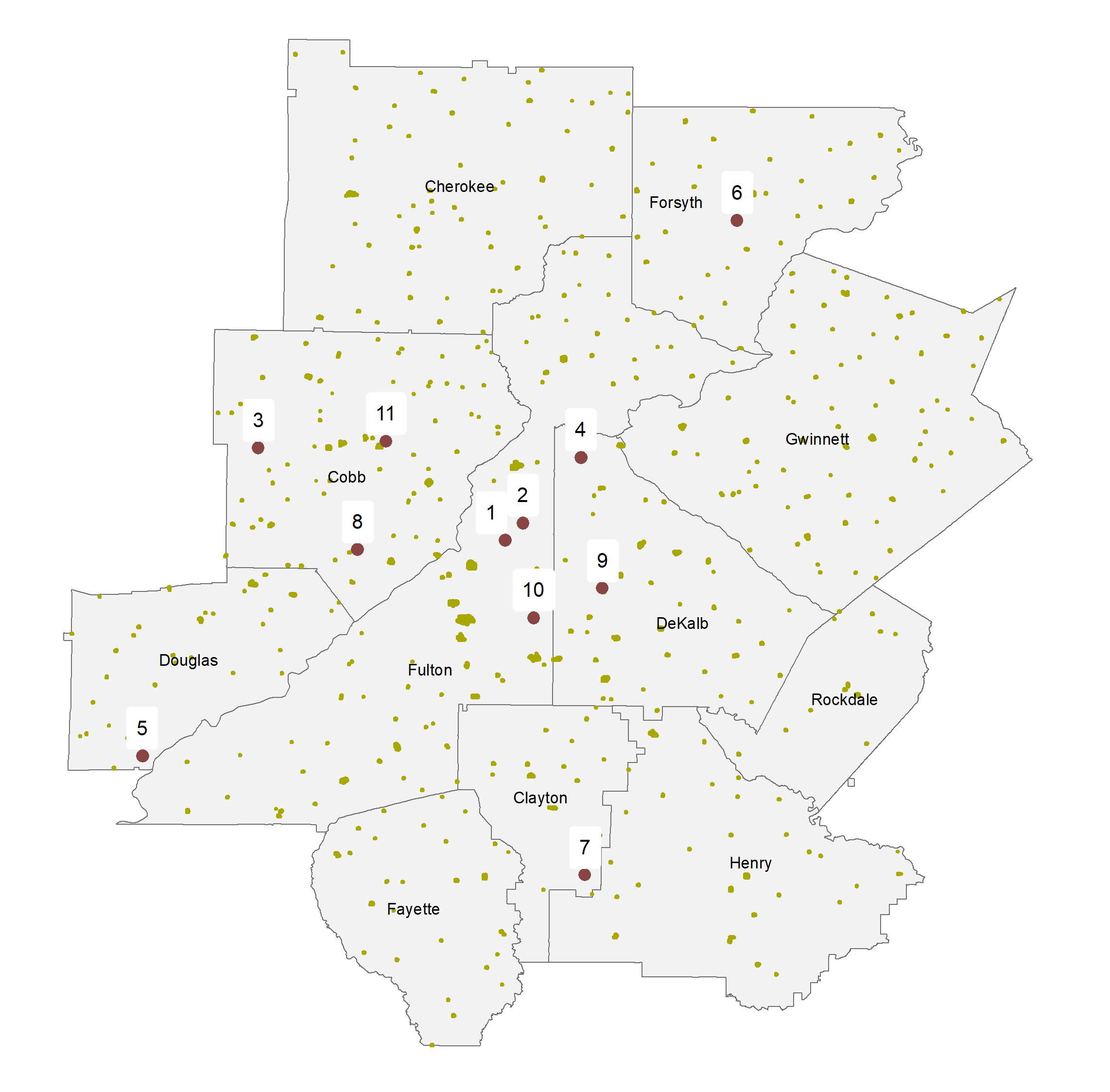
Honoring Heroes: Access to VA Healthcare for Disabled Veterans in Atlanta
In observance of Veterans Day, we examine the spatial match between VA facilities and the locations of disabled veterans.

Welcome to Atlanta [1]
Welcome to Atlanta! Where are you from?
Happy Halloween! Historic Cemeteries in the Atlanta Region
It's fabled that on Halloween the veil between living and dead is the thinnest. One way to celebrate the holiday is to connect with the generations that came before us by visiting historically significant cemeteries and learning about the people buried there.

Monday Mapday: Aging Immigrant Populations
Our foreign-born population is older than you might think, on a percentage basis.
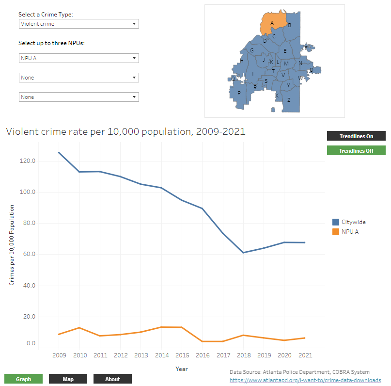
Crime Rates in the City of Atlanta: A Deeper (Spatial) Dive
A deeper dive into City of Atlanta crime rates explores how historical trends vary by Neighborhood Planning Unit.

Mapping Poverty Over Time, 2005 to 2020
The Census Bureau's Small Area Income and Poverty Estimates give us a view into how poverty has changed across Georgia counties.