
If the pandemic has taught us anything, it’s that our days and weeks can bring constant and unwelcome surprises. As schools face the possibility of an omicron wave among their own population of students, teachers and faculty, it’s likely a lot of parents will see quick changes to online classrooms in the coming weeks. However, not all communities across Atlanta are positioned to absorb these quick changes as easily as others.
The following series of maps take a look at computer and internet access, followed by a look at shares of children in different age groups across the metro and a data explorer allowing a deeper dive into the three indicators at the tract level.
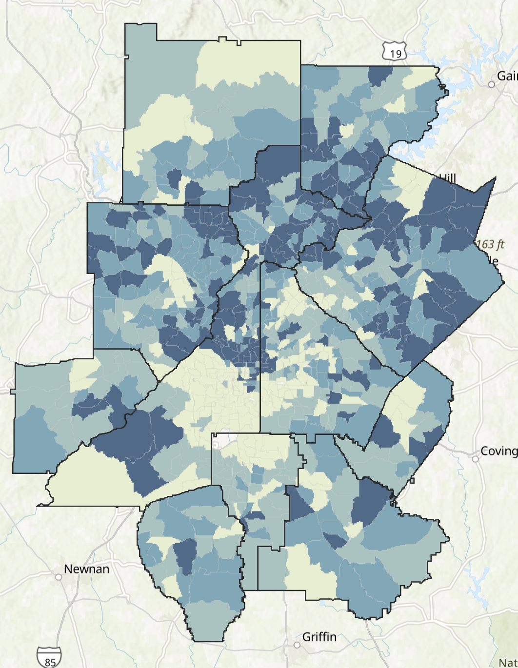
Computer Access
To the right we’re seeing a little piece of better-than-usual news from our data: The lowest share of households with a computer in the 11-county area is 63 percent. While any households without a computer today represents a problem not just for online learning but also for parents seeking jobs and a host of other seemingly normal at-home activities, it is still heartening to see that a majority of households across the metro. The color ramp is in quartiles, so the 63 to 91.5 percent range represents the lowest 25 percent of households. The average across the dataset is nearly 94 percent.

Source: ACS 2015-2019 with processing and analysis by ARC
Map 1: Shares of Households with a Computer
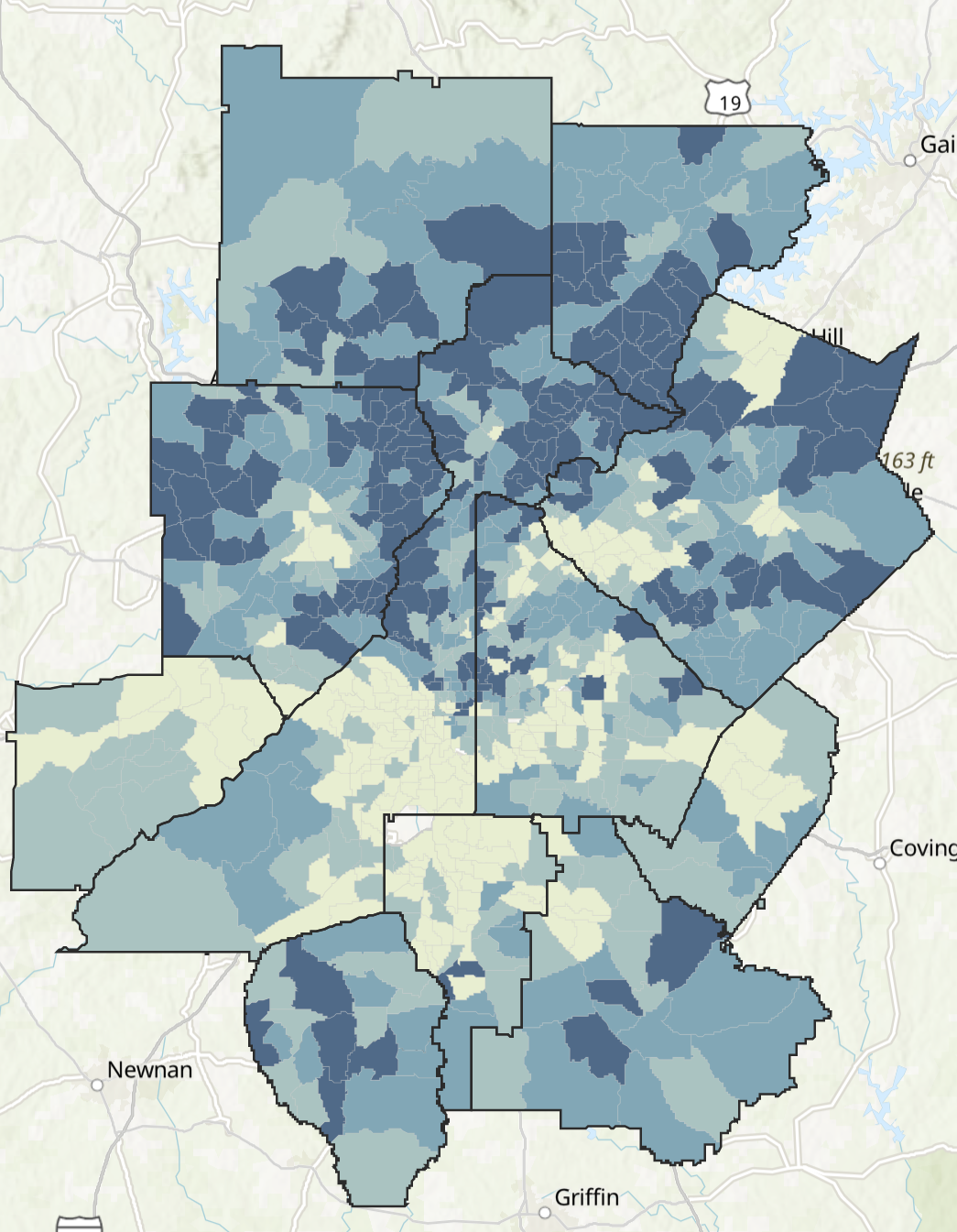
Internet Access
When looking at households with internet access, the picture becomes more complex. The color ramp is based on quartiles, with the lightest shade representing the lowest 25 percent of households with access. Here, we can see that this lowest quartile begins with a much lower access rate than we see for computers such that in some Census tracts, only 27 percent of residents have internet access. The average rate here is also lower than in the map above, at 86 percent.
What can we glean? First, that there is a decent share of households in the metro that have a computer but no internet access. Online learning obviously requires access to both (and in the age of cell phones and iPads, one could argue that the internet is more important than computers). Second, we do see areas in the metro where households have low shares of computer access and internet access.

Source: ACS 2015-2019 with processing and analysis by ARC
Map 2: Shares of Households with Internet
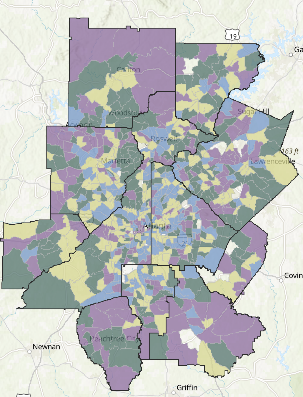
School-Age Children
Finally, we’re taking a look at what age group represents the largest share of children in each Census tract. Do note that throughout the metro, adults represent the largest share of residents in each Census tract. However, in taking a look at shares of children by age group to the right, we can see that most census tracts see large shares of elementary- and school-age children, and this includes areas with low computer and internet access.

Source: ACS 2015-2019 with processing and analysis by ARC
Map 3: School-Age Children 19 and Younger in the 11-County Area
Explore More
Feel like geeking out? You can take a look at detailed information using the explorer tool below. Turn different data of interest on or off using the checkboxes to the left of the map, and click on a Census tract to see more details about access and ages. Turn two layers on and click the slider icon in the upper left corner of the map to directly compare two layers using a slider bar.
Want to literally see the bigger picture? Click here to open the map in a new window.