Yesterday was a big day for us data geeks. Seriously, it was like a high holiday for us because the Census finally released the results of the 2020 Census. They didn’t release a lot of information – only total population, population by race and ethnicity, housing units and voting age population. But these data still paint a rich picture of how our region has changed over the past decade. And, as we do, we made some maps that look at the results at small areas called (ironically) Superdistricts, which are sub-county areas that provide a more granular look at these population trends. So let’s get to it with some rapid-fire observations of the 2020 Census for our region.
The big picture: total population change
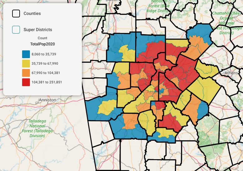
As most of us know, we have a population imbalance in this region where most of our residents live in the northern parts of the region. As Map 1 shows, the 2020 Census reveals that this is still the case.
Map 1: Total Population 2020

Related to the above, the areas that added the most population since 2010 are, you guessed it, mostly in the north (Map 2). In fact, the N Gwinnett Superdistrict (it borders Hall County) added the most population, up some 45,000 new residents.
Map 2: Change in Total Population, 2010 to 2020

The big story: demographic change
The biggest story out of the 2020 Census, however, is found in how the composition of our residents has changed. It is actually an acceleration of trends we’ve been discussing for years – we are becoming more diverse, and every bit of data we received yesterday confirms this.
Change in White populations
Most Superdistricts lost share of White populations, meaning that the percentage of total population that is identified as White went down over the decade. In fact, there were only six Superdistricts (out of 78) that experienced an increase in the share of White Populations. And all these areas are located in Fulton and DeKalb, predominantly in the City of Atlanta. (Maps 3 and 4, below)
Map 3: Change in the % of White Populations, 2010-2020

Map 4: Areas That Increased Share of White Populations, 2010-2020

Change in Black Populations
Only a few areas lost share of Black populations during the past decade. Those areas that had the greatest declines are also located in Fulton and DeKalb, mostly in the City of Atlanta. You’ll see that these are the same areas that saw the greatest increases in the share of White populations. (Maps 5 and 6, below)
Map 5: Change in the % of Black Populations, 2010-2020

Map 6: Areas That Decreased Share of Black Populations, 2010-2020

Change in Asian & Hispanic Populations
As with the pattern of total population, Asian populations are mostly clustered in the northern parts of the region, and those are the areas that saw the largest increases in the share of Asian populations, which includes all three Superdistricts in Forsyth County. (Map 7, below left)
The heaviest concentrations of Hispanic populations are scattered throughout the region, mostly in suburban town centers like Canton, Dallas, Marietta, Gainesville and Winder. And, again that is where we see the largest increases in the share of Hispanic populations. (Map 8, below right)
Map 7: Change in the % of Asian Populations, 2010-2020

Map 8: Change in the % of Hispanic Populations, 2010-2020

The trend to watch: multiracial and other identifications
Perhaps one of the most dramatic changes is the growth of population identifying as some other race, or identifying as multiple races. The labels that the Census uses don’t do a good job of capturing how diverse we really are, forcing us to check one of only five or six boxes. In the past couple of Censuses, however, respondents had the opportunity to identify as a single race/ethnicity combination (remember, Hispanic is an ethnicity that consists of multiple races) or as multiple races. And as you’ll see, every area in the region saw an increase in the share of those identifying as some other race or multiple races. (Map 9, below)
Map 9: Change in the % of Other Races, 2010 to 2020

Keep an eye on the kids: populations age 18 and younger
Finally, the Census did include an age breakdown that will be used to redraw legislative districts. We know which areas added shares of 18 and older populations, and through subtraction, we know which areas added shares of under 18 populations. For the latter, there simply weren’t that many, as we all know we are growing older. But the areas in downtown Atlanta, Decatur and northern Dekalb defied this general aging trend over the past decade.
Map 10: Areas that added under-18 populations

Overall, the trends point to a story that we have been telling for many years — the Atlanta region is changing into a melting pot of races and ethnicities from all over the world. But seeing it confirmed in the richest dataset we have at our disposal is exciting, at least for us data geeks.

