The State of Black-Owned Businesses in Metro Atlanta (pt. 2)
Following up from an earlier post, we look at a few characteristics of Black-owned employer businesses in metro Atlanta.

Following up from an earlier post, we look at a few characteristics of Black-owned employer businesses in metro Atlanta.
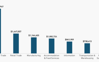
Today's post looks at the latest data from the Census Annual Business Survey, comparing Metro Atlanta to the national baseline and other Sunbelt cities regarding Black-owned employer businesses.
Release and highlights from the latest Atlanta regional perception and attitude survey (August, 2025)
This post highlights the Family Budget Calculator, an interactive tool showing income and expenses for a "modest yet adequate standard of living" in metro Atlanta.
Marking Equal Pay Day by exploring educational attainment and the wage gap in metro Atlanta.
Exploring high-level trends in the metro Atlanta single-family housing market since the onset of the pandemic.
A look at the gap between labor force participation rates for males vs. females.
Many different ways to (and measures for) of look at congestion, by metro...
New data from the Census Annual Business Survey shows that Metro Atlanta continues to be a hub for Black-owned employer businesses.
What are the spatial trends in property crime incidence within the City of Atlanta?


