While any time is a good time to celebrate the state’s Black community, February always gives us a chance to do what we enjoy most — making interactive maps that help us understand how things are today and how they have changed over time. The series of maps and data explorer that follow use 2020 Census data at the tract level. The 2010 and change figures are also calculated to apply to the 2020 tracts, even though the original (2010) boundaries are different.
The next two maps show the share of Black residents at the 2020 Census tract level throughout the state. We can see that there is a pretty stable spatial pattern, with large clusters in our urban areas and in the counties of Southwest Georgia.
Black Residents as a Share of Total Population, 2020
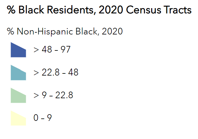
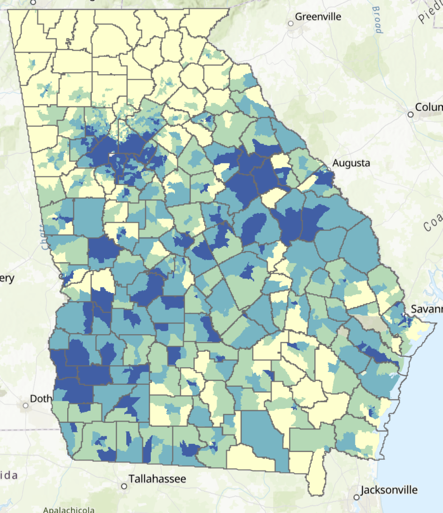
Source: 2020 U.S. Decennial Census
Black Residents as a Share of Total Population, 2010
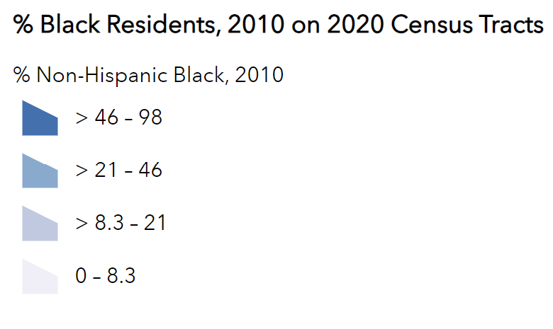
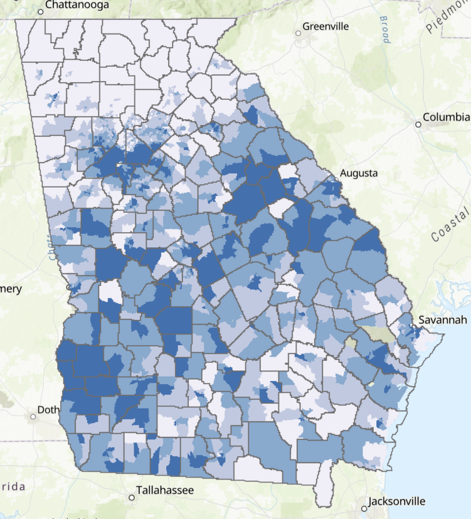
Source: 2020 U.S. Decennial Census
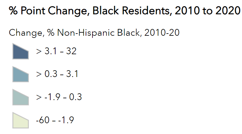
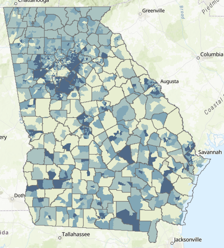
% Point Change, Share of Black Population, 2010 to 2020
Below, we’re taking a look at gains and losses in Black residents at the Census tract level, using 2020 Census tracts. Here we see an interesting, if predictable, pattern: Areas with higher shares of Black residents are also seeing greater loss of Black residents, whereas tracts with the lowest rates of Black residents are seeing the greatest gains.
Source: 2020 U.S. Decennial Census
Explore More
The interactive map below allows you to compare layers, with pop-ups providing detailed race and ethnicity data. Additionally, you can use the slider widget on the upper part of the map to directly compare the top-most selected layer to a layer below it, or you can hit the arrow at the bottom of the map to reveal a spreadsheet with even more information.

