Monday Mapday: Change in Race and Ethnicity, 2000-2017
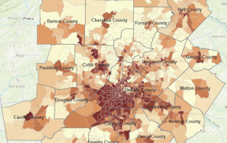
A series of maps comparing percent point change in white and black residents at the county and tract level, followed by a map explorer tool with additional data.

A series of maps comparing percent point change in white and black residents at the county and tract level, followed by a map explorer tool with additional data.
A nationwide and statewide look at job density and job density change over time.
This Monday Mapday considers the geographic concentration of multifamily housing across ARC's 21-county metro.
It may not quite feel like sweater weather yet, but the metro's fall colors are ready to signal it's time to don a cozy cardigan.
How does Georgia stack up when it comes to shares of Native American and Alaska Native peoples? These maps take a look at these shares, by tract and county, across the country and the state.
Two statewide maps showing the percent of deaths related to breast cancer and the years of potential life lost due to the disease.
This Monday Mapday considers the percent of residents who have moved in the past year and whether they hopped across the same county, came to the 10-county area from a different Georgia county or moved from outside the state or country.
How many children are born into families with at least one foreign-born parent in Georgia? This Monday Mapday looks at the data by county and how things have changed since 2010.
This Monday Mapday continues our look at where unmarried Atlantans live, this time focusing on unmarried men.
This Monday Mapday continues our look at where unmarried Atlantans live, this time focusing on unmarried women.