On Friday, we took a look at the percent of deaths and years of potential life lost due to breast cancer in the 10-county area. For this Monday Mapday, we’re putting that in context with two statewide maps.
The map below shows the five-year aggregate of the percent of deaths related to breast cancer throughout the state. The big takeaway here? We typically say that the metro area is relatively healthy compared to Georgia overall. When it comes to breast cancer, however, we’re seeing that it plays a larger role in death in many of our counties than it does in many other parts of the state.

Image and data source: Georgia Department of Public Health via OASIS
% of Deaths due to Breast Cancer, 2014-2018

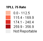
The map below takes a look at premature death related to breast cancer and shows that metro-area counties aren’t leading the state when it comes to breast cancer-related premature death.

Image and data source: Georgia Department of Public Health via OASIS
YPLL 75 Rate due to Breast Cancer, 2014-2018


