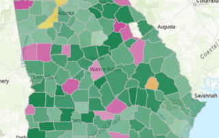
Health Assessment: the 11-County’s Health Rankings in 2021
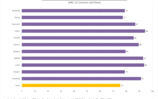
With the holiday indulgence season here, we're offering a look at how our counties measure up on healthy behaviors year-round.

With the holiday indulgence season here, we're offering a look at how our counties measure up on healthy behaviors year-round.
An animation showing population growth at the Census tract level over the past 30 years illustrates where and how we've grown since 1990.
Yes, we've mapped where you're most likely to get a lot of trick-or-treaters ... but more importantly, we've mapped where the candy spending is highest per household.
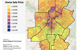
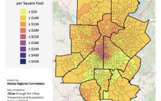
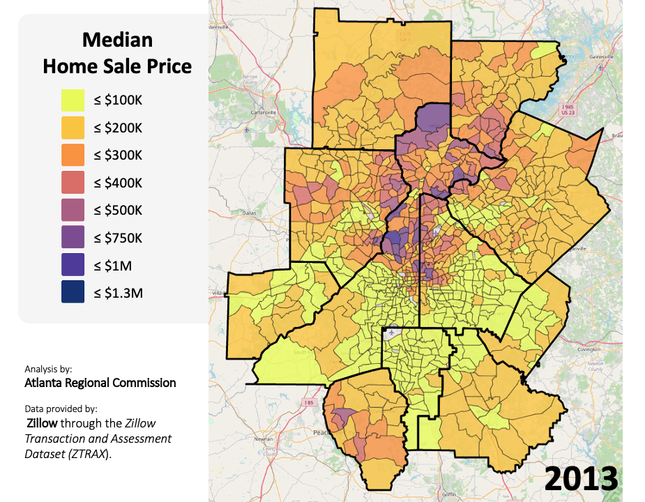
The Research & Analytics Group at ARC just completed an in-depth analysis of home sales transactions for ARC's 11-county planning region for the eight years spanning from 2013 to 2020. This analysis replaces the first home sale price change analysis completed in 2019, which looked at just 2013 and 2018 and did not include the [...]
To what degree are Georgians employed in manufacturing? And in what areas is it the most dominant industry of employment? This post offers a quick glimpse into the state of manufacturing careers in Georgia.
Our 2021 celebration of Hispanic culture in the 11-county metro continues with a look at the country of origin for our Hispanic residents.
When can you expect to see some colorful foliage from the comfort of your home? Smokymountains.com has released its annual fall foliage map to provide us with an idea of when we'll get a change of scenery.
In 2020, COVID-19 rivaled heart disease – long our state's #1 killer – in terms of life lost and percent of deaths by cause (map shown). Not even the worst years of the flu come anywhere close.


