
The Research & Analytics Group at ARC just completed an in-depth analysis of home sales transactions for ARC’s 11-county planning region for the eight years spanning from 2013 to 2020. This analysis replaces the first home sale price change analysis completed in 2019, which looked at just 2013 and 2018 and did not include the ARC’s newest member, Forsyth County. In addition to the expanded time-frame and filling in the gaps with interceding years, the newest analysis utilizes an improved cleaning method intended to better capture the full range of “arm’s length” home sale transactions across the region.
Both the initial analysis and this most recent update are crucial components of the Metro Atlanta Housing Strategy (MAHS). At the time of the first home sale price change analysis, the most current full year of data was 2018, and 2013 was the start year because it was the first full year following the Atlanta region’s double dip housing recession. The results of the first analysis were a key input into defining the 10 submarkets serving as the spatial framework for the region’s housing strategy. In the interest of not disrupting the strategy’s spatial framework (at this time), the most recent analysis leaves the submarket designations unchanged (except, that is, for the addition of Forsyth). The purpose of this most recent analysis is to provide an updated and expanded view into the year-to-year and longer-term home sale price trends across the region’s various neighborhoods and submarkets. Currently, this updated information can be found on the MAHS site’s city-, county-, and submarket-level market snapshots as well as in an interactive capacity on the recently upgraded MAHS Data Explorer.
A Quick Look at Some Results
Two principal measures of interest from our most recent analysis are median home sale price and home sale price per square foot. While related, these two indicators reveal somewhat different aspects of home sale price trends within the region. Median home sale price provides an indication of what a typical home was sold for in a given area each year. While this is helpful for understanding spatial variability and changes in affordability/access to home ownership across the region, it does not consider the large differences in the size of homes from neighborhood to neighborhood and therefore is limited in its utility as a standardized measure at the regional scale. A more useful measure for comparing neighborhoods and seeing change in affordability over time regionally is home sale price per square foot. In essence, by accounting for the variability in the size of homes (most pronounced between core and rural areas), this indicator provides a way to comparatively measure differences and changes in the premium on livable space associated with a given area.
Below are two census tract-level animated maps showing the change over time of both measures from 2013 though 2020, followed by two static maps showing the percent change in the indicators from the beginning to the end of the time period.
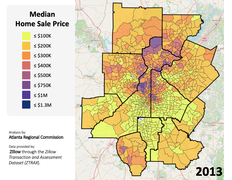
Animated map showing change in median home sale price from 2013 to 2020 in the ARC 11-county region. Individual maps created using the free data visualization platform DataNexus, developed and hosted by Neighborhood Nexus.
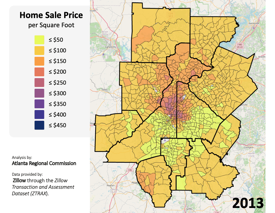
Animated map showing change in home sale price per square foot from 2013 to 2020 in the ARC 11-county region. Individual maps created using the free data visualization platform DataNexus, developed and hosted by Neighborhood Nexus.
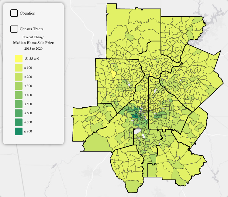
Static map showing relative change in median home sale price from 2013 to 2020 in the ARC 11-county region. Map created using the free data visualization platform DataNexus, developed and hosted by Neighborhood Nexus.
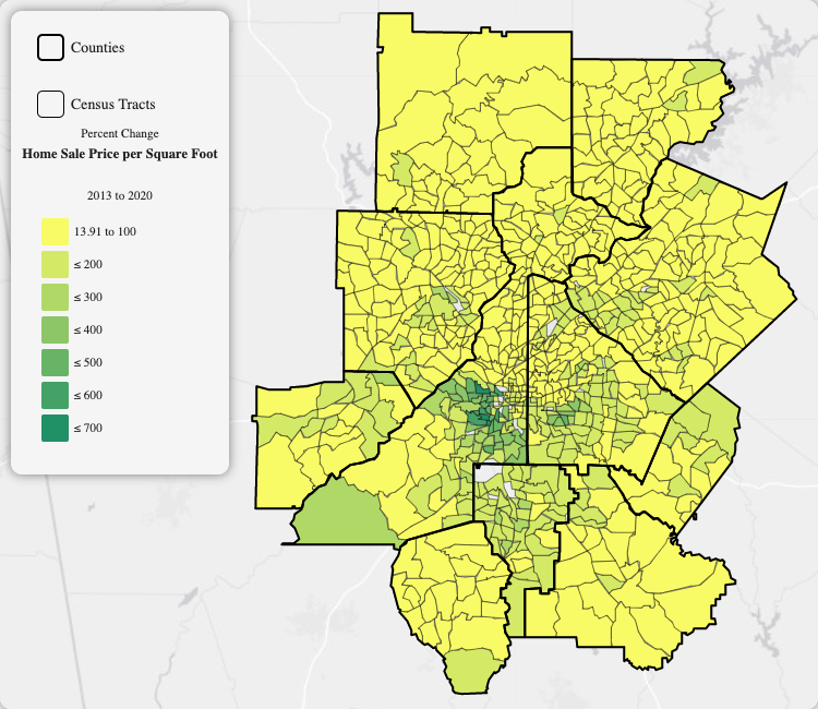
Static map showing relative change in home sale price per square foot from 2013 to 2020 in the ARC 11-county region. Map created using the free data visualization platform DataNexus, developed and hosted by Neighborhood Nexus.