Commuting: Yeah, It’s Still Kind of a Big Deal
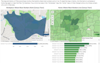
Our updated Commuting Dashboard gives an immediate snapshot of the commuting landscape, and enables custom analysis of patterns by census tracts of job locations and worker residences

Our updated Commuting Dashboard gives an immediate snapshot of the commuting landscape, and enables custom analysis of patterns by census tracts of job locations and worker residences
Wages are going up. But so is inflation. What does it mean for real trends in Atlanta wages and how do the findings differ by metro area?
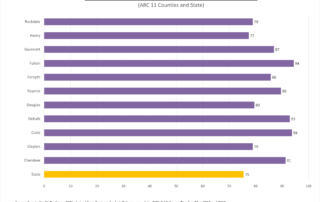
With the holiday indulgence season here, we're offering a look at how our counties measure up on healthy behaviors year-round.
Results for the 2021 Metro Atlanta Speaks survey were released yesterday as part of the State of the Region Breakfast. This post compiles all the places you can go to learn more about the attitudes and perceptions about life in the 11-county area, from high-level overviews to data exploration dashboards.
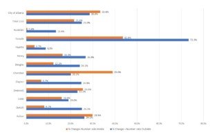
New (2019) data on work locations for residents (by area) show that, for the most part, we are leaving our home county more to go to work than we were in 2010.
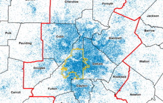
An animation showing population growth at the Census tract level over the past 30 years illustrates where and how we've grown since 1990.
The World Series of Data...er, Baseball...starts tonight. Here's your ARC GameDay stats preview!
With the Braves heading to L.A., now is a good time to take a look at how the two cities compare in non-sports stats.
A look at coming population growth in the metro area's Hispanic community.
Comparisons for hospitalizations and ER visits for the flu, heart disease and COVID-19 are less dramatically uneven than what we saw in our examination of COVID death data. But we still see that COVID-19 comes out on top when it comes to things that sent us to the hospital in 2020.