
You’ve doubtless heard plenty about how expensive housing in metro Atlanta has become. Recently, the Atlanta Fed’s Home Ownership Affordability Monitor showed that metro Atlanta’s housing market has become unaffordable, and lots of media coverage have sounded this alarm, including this one from the Reinvestment Fund as posted in the Saporta Report. Of course, we have written about it on this blog, the latest being earlier in the year. We’ve seen double-digit housing spikes annually for several years now. Since 2014, according to the Zillow Home Value Index (ZHVI), home prices have more than doubled in the metro area, from around $166K in April of 2014 to $368K as of April of 2022. So, yeah, housing prices are up significantly.
What’s making it even more painful for those trying to elbow their way into homeownership, however, is the fact that wages simply aren’t keeping up. In fact, they aren’t even particularly close to keeping up with rising prices. Below are couple of charts that illustrate this.
First, a longer view. To compare the monthly percentage change in both hourly wages (from the Bureau of Labor Statistics) and home prices (ZHVI), we indexed to a common starting point so we can better compare how much the two time series differ. Figure 1, below, shows how the two series have diverged since 2007. In taking this longer view, you see that wages remained flat on a nominal basis for six straight years, but they didn’t experience the dramatic decline that home prices did during this period. (Indulge me one quick aside: the wage data we are using here obviously measure only those with jobs. We know that almost 200,000 jobs were lost during this period, and thousands of homeowners were underwater on their mortgages, which caused the foreclosure rate to spike. So in looking back at the wage-change-to-home-price-change ratio, it might have seemed favorable for home-buying during the Great Recession. It wasn’t, certainly not for the average family.)
It took the housing market and the overall economy almost seven years to recover from the Great Recession. In late 2013/early 2014, both wages and home prices started to rise, but prices started rising much faster than wages. And you can see how stark the divergence is over the past two years of the pandemic.
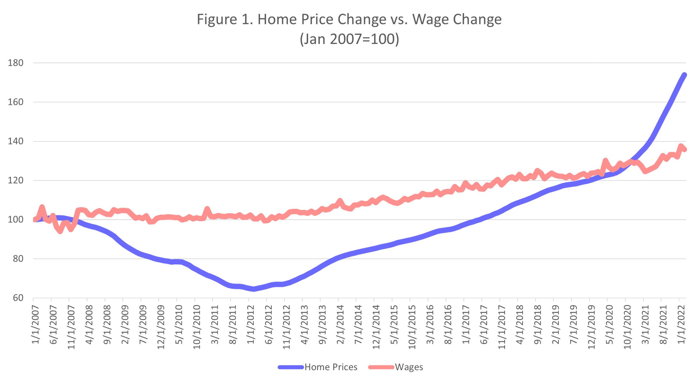
Sources: Bureau of Labor Statistics and ZHVI
Figure 1’s longer view masks just how quickly and by how much home price appreciation began to outpace wage increase. Take a look at Figure 2. Here we set our index to a starting point of January 2014 and immediately see the rapid acceleration of home prices compared to only modest wage gains. A 27 percent increase in nominal wages from 2014 to 2022 would be something to celebrate (especially if we leave inflation out of the equation!), but that growth pales next to the 117 percent increase in home prices. And that gap has widened dramatically in the past two years.
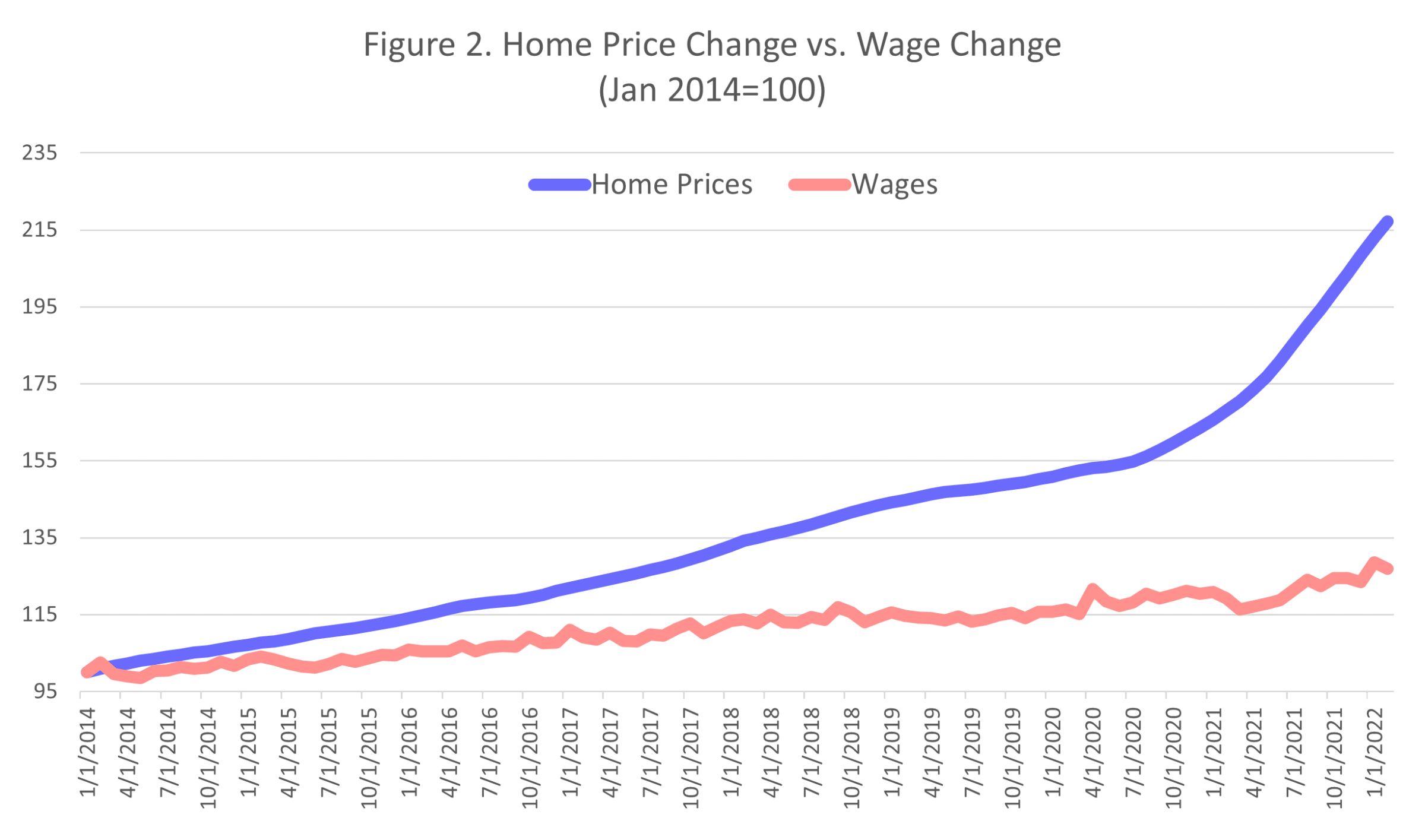
Sources: Bureau of Labor Statistics and ZHVI
Of course there are lots of reasons home prices have risen so much – material costs, land costs, limited inventory, the list goes on. But with wages not even coming close to keeping up with home prices, the pain that prospective homebuyers feel has only become more acute.