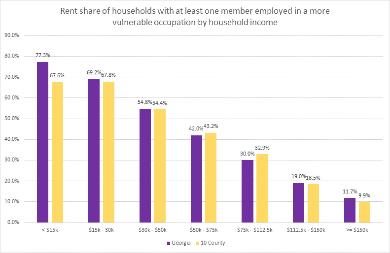
Monday Mapday: Reminder of Ready Resources–COVID-19
Months now into the time of the coronavirus, this week's Monday Mapday is a timely reminder of existing ARC-built webpages tracking data and resources associated with this pandemic
So we've posted recently about mobility during COVID-19--how we have traveled less and when those declines happened. This week, we use the same data source (Safegraph) to look at how and when our pandemic-period mobility changes vary by industry sector.
Many of us have been home a lot lately--not necessarily home alone, but home--with the obvious goal of slowing the spread of COVID-19. How much have our movement patterns changed, and where and when did those patterns change the most? Check out a multi-featured dashboard for some custom insights.
COVID-19 has led to dramatic shifts in our professional and ecucational lives. Far more workers telecommute in this "Corona World", and almost all students have to attend classes remotely. But this "remote world" is not as readily available to all of us. The maps in this post show shares of households wiith internet access (and conversely, those without), along with the shares of resident workers employed in office jobs to which they could likely telecommute.
Social distancing is not far from the top of our minds these days. What difference has it made to mobility? See this dashboard for answers!
While the medical and public health communities continue to work towards flattening the curve for COVID-19 infections, data continues to show that older adults may be at higher risk for severe illness from coronavirus. A few weeks ago on this blog, we provided information on the spatial distribution of the senior population in Georgia: https://33n.atlantaregional.com/monday-mapday/monday-mapday-older-populations [...]
With numbers of diagnosed COVID-19 cases and related deaths continuing to rise, it is ever more critical to identify and mitigate risk factors for the disease.. Cardiovascular health has recently emerged as a risk factor for heightened severity of, and worse outcomes for, coronavirus infections. Maps here show an overlay of current cases with relative concentrations of serious cardiovascular issues, for all ages and for those aged 65 and up.
April 1 this year is known in data circles not as April Fools Day, but rather as Census Day. In these times of pandemic, response to this decennial data collecton effort is even more critical than usual.
With case numbers continuing to rise, the economic impact of COVID-19 continues to grow. This post's interactive maps overlay cases by county with measures of economic vulnerability.
As the USA tries to slow the spread of COVID-19 with social distancing and other measures, it's instructive and sobering to review the extent and rapidity of the coronavirus's spread across the world, the country, and the state of GA. These interactive maps provide data visualizations to track the pandemic.