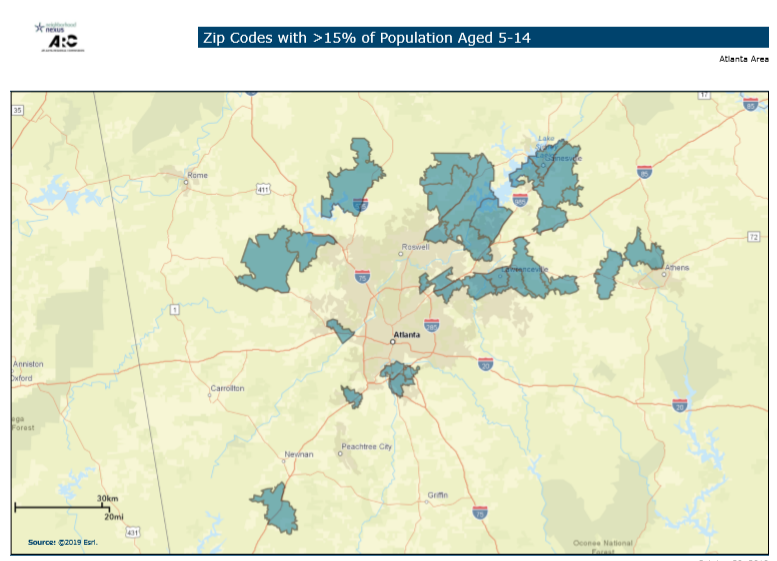
Web Wednesday: Trick-or-Treaters — Tiny Trickle or Fearful Flood?
Trick-or-treaters might SEEM to be everywhere, but do the data say that it's an illusion?

Trick-or-treaters might SEEM to be everywhere, but do the data say that it's an illusion?
It may not quite feel like sweater weather yet, but the metro's fall colors are ready to signal it's time to don a cozy cardigan.
Driving alone remains the commuting option of choice for the 10-county metro, but its rates vary by location and occupation.
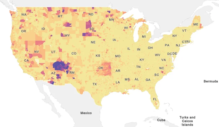
How does Georgia stack up when it comes to shares of Native American and Alaska Native peoples? These maps take a look at these shares, by tract and county, across the country and the state.
Some encouraging data on recent trends in formation of, employment at, and revenue produced by women-owned businesses.
Two statewide maps showing the percent of deaths related to breast cancer and the years of potential life lost due to the disease.
Breast cancer awareness month is upon us. This post considers what percent of state and metro-area deaths are a result of the disease, as well as how much it contributes to premature death and racial disparities in this worst-case outcome.
This month's snapshot covers ARC's regional forecasts, including race and age trends. By 2050, we currently predict the population to increase by 2.9 million people and the fastest-growing age group will be among those 75 and older.
This Monday Mapday considers the percent of residents who have moved in the past year and whether they hopped across the same county, came to the 10-county area from a different Georgia county or moved from outside the state or country.
We know that counties in the metro are growing in population, so where are people coming from? This post looks at domestic migration over the past decade.