Monday Mapday: Multifamily Housing
This Monday Mapday considers the geographic concentration of multifamily housing across ARC's 21-county metro.



This Monday Mapday considers the geographic concentration of multifamily housing across ARC's 21-county metro.
An overview of the retail sector in the 10-county metro area, looking at common areas of consumer spending as well as retail jobs.
A dive into differences in unemployment rates based on education, sex and age.
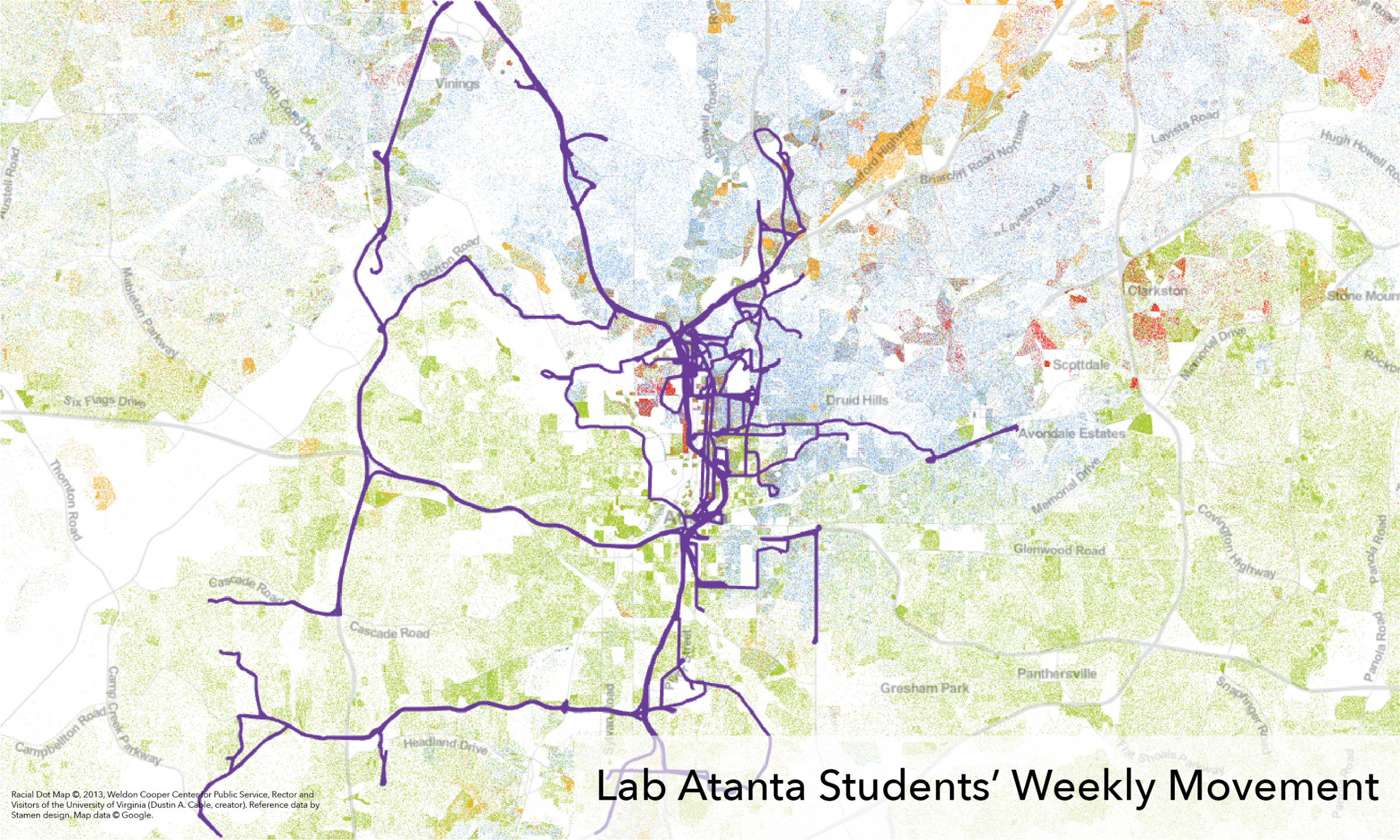
Two maps — one showing college students' movement and another showing high school students' movement over the course of a week in Atlanta — offer an idea of just how much of the city these students' might regularly experience.
Charts and maps taking a look at our rates of veterans across the country and statewide.
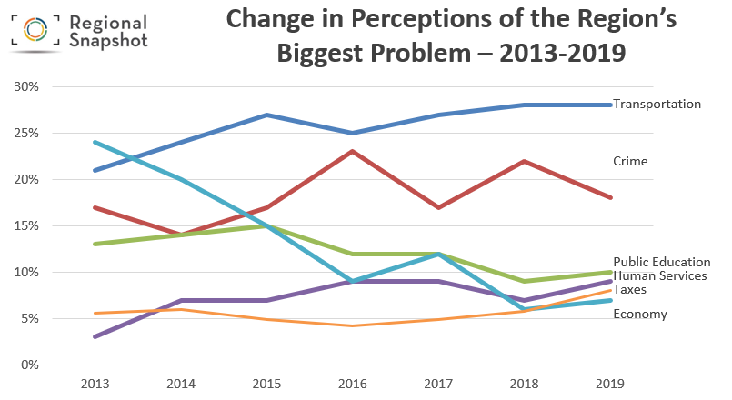
This month's regional snapshot presents summary findings for ARC's 2019 Metro Atlanta Speaks Survey, providing a detailed slide deck and a link to a really great Tableau data dashboard .
A collection of highlights gleaned from our recently updated 20-County dashboard.
Our most recent update of The Quarter analyzes economic data in metro Atlanta for Q2 2019. The Quarter includes data on employment, home price indices, building permits, retail and office space, and more, with the goal of identifying what areas of our economy are striving and what areas are slower to recover. Visit The [...]
An overview of disparities in homeownership across the metro.
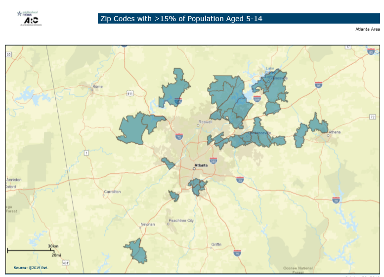
Trick-or-treaters might SEEM to be everywhere, but do the data say that it's an illusion?