Data Diversion: Highlights from the 100 Metros Dashboard
Neighborhood Nexus' 100 Metros Dashboard makes it easy to find general data about the Atlanta MSA and compare it to the country's other largest 100 metro areas.



Neighborhood Nexus' 100 Metros Dashboard makes it easy to find general data about the Atlanta MSA and compare it to the country's other largest 100 metro areas.
An overview of average household spending on recreation and fitness equipment in ARC's 10-county area.
This month's regional snapshot provides an overview of historic, current and forecast economic trends at the cusp of 2020 .
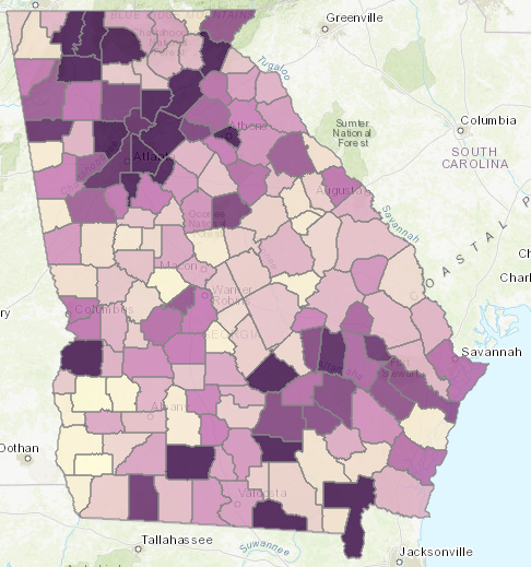
A series of static maps and an interactive tool exploring population change throughout the state.
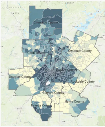
Examining population change in the 10-county area since 1980, including absolute population change, percent change and changes in density.
This Monday Mapday considers both our residents who do not speak English inside the home as well as residents who do rate themselves as speaking English less than very well.
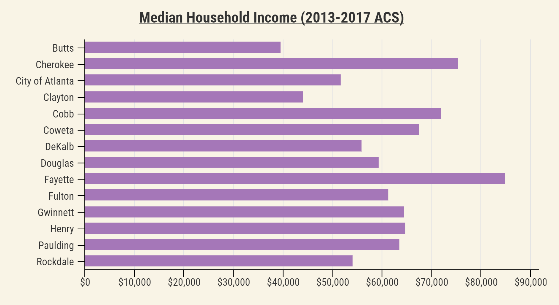
A look at how differences in income are related to differences in our opinions and beliefs about life in Atlanta, with a focus on housing affordability and workforce development.
A series of maps comparing percent point change in white and black residents at the county and tract level, followed by a map explorer tool with additional data.
A look back at how metro Atlanta's diversity has grown and changed since 1980.
A nationwide and statewide look at job density and job density change over time.