
Monday Mapday
Maps showing themes and trends, published on Mondays
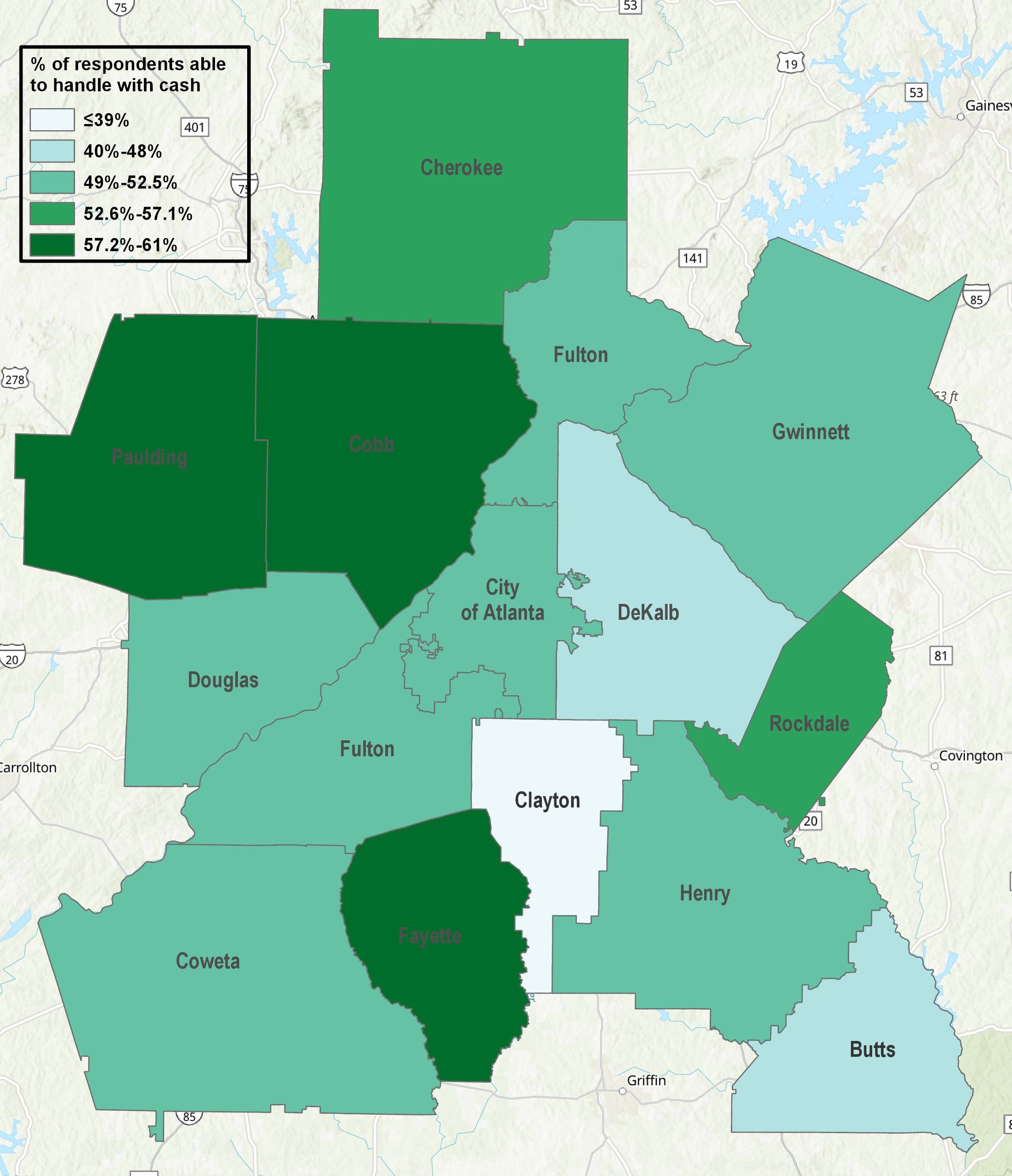
Monday Mapday: Handling Emergency Expenses in the Metro
The Fed recently found that 40 percent of Americans aren't able to handle a $400 emergency expense. This Monday Mapday uses Metro Atlanta Speaks data to consider how this plays out across the 13-county area.

Monday Mapday: Who’s Going Hungry?
A view into which Metro Atlanta counties are most likely to see residents skip or reduce the size of meals due to a lack of financial resources.
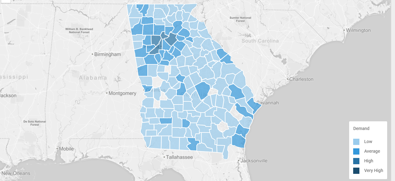
Monday Mapday: Nurses Week
In celebration of Nurse's Week 2019, we're taking a look at the labor demand for the profession, as well as the current wage outlook for those in the industry.

Monday Mapday: College Education in Metro Atlanta
College graduation season has begun! These maps show where the most residents with a bachelor's and beyond live and which degree categories are most popular.

Earth Day 2019: The City in the Forest is Growing
These animated GIFs show the growth of Atlanta's urbanized areas from 1984 to 2016.

Monday Mapday: New DASH Tool to Visualize Equitable Target Areas (ETAs)
How do local governments decide where to invest public funds? Better yet, how can local governments help ensure that these investments are distributed to projects in an equitable manner? Unfortunately, there is no single, [...]