
Monday Mapday
Maps showing themes and trends, published on Mondays
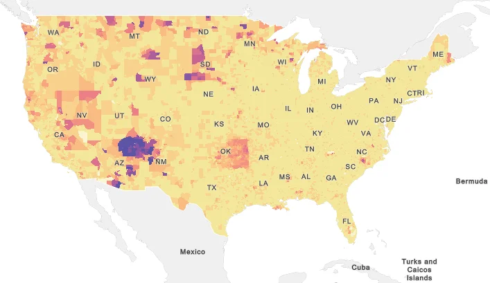
Monday Mapday: Our Indigenous Population (Focusing on Native Americans)
How does Georgia stack up when it comes to shares of Native American and Alaska Native peoples? These maps take a look at these shares, by tract and county, across the country and the state.

Monday Mapday: A Statewide View of Breast Cancer Death
Two statewide maps showing the percent of deaths related to breast cancer and the years of potential life lost due to the disease.

Monday Mapday: A Tract-Level View of County Migration
This Monday Mapday considers the percent of residents who have moved in the past year and whether they hopped across the same county, came to the 10-county area from a different Georgia county or moved from outside the state or country.

Monday Mapday: Families with Foreign-Born Parents
How many children are born into families with at least one foreign-born parent in Georgia? This Monday Mapday looks at the data by county and how things have changed since 2010.

Monday Mapday: Where do the Metro’s Unmarried Males Live?
This Monday Mapday continues our look at where unmarried Atlantans live, this time focusing on unmarried men.

Monday Mapday: Where do the Metro’s Unmarried Females Live?
This Monday Mapday continues our look at where unmarried Atlantans live, this time focusing on unmarried women.