Data Diversion: Mobility Change after COVID-19 Outbreak in Georgia
Social distancing is not far from the top of our minds these days. What difference has it made to mobility? See this dashboard for answers!

Social distancing is not far from the top of our minds these days. What difference has it made to mobility? See this dashboard for answers!
While the medical and public health communities continue to work towards flattening the curve for COVID-19 infections, data continues to show that older adults may be at higher risk for severe illness from coronavirus. A few weeks ago on this blog, we provided information on the spatial distribution of the senior population in Georgia: https://33n.atlantaregional.com/monday-mapday/monday-mapday-older-populations [...]
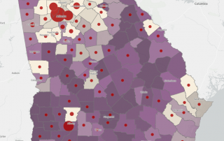
With numbers of diagnosed COVID-19 cases and related deaths continuing to rise, it is ever more critical to identify and mitigate risk factors for the disease.. Cardiovascular health has recently emerged as a risk factor for heightened severity of, and worse outcomes for, coronavirus infections. Maps here show an overlay of current cases with relative concentrations of serious cardiovascular issues, for all ages and for those aged 65 and up.
With case numbers continuing to rise, the economic impact of COVID-19 continues to grow. This post's interactive maps overlay cases by county with measures of economic vulnerability.
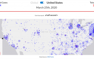
As the USA tries to slow the spread of COVID-19 with social distancing and other measures, it's instructive and sobering to review the extent and rapidity of the coronavirus's spread across the world, the country, and the state of GA. These interactive maps provide data visualizations to track the pandemic.
This month's regional snapshot provides summary findings from an initial review of a just-released new and (vastly) improved version of a 100 Metros Data Dashboard. This tool enables easy access to interactive rankings of the top 10 major metros, across data in topic areas such as demographics, economics, health, and housing.
An overview of how ischemic heart and vascular disease — the state's No. 1 killer — affects Atlantans today and how its impact has changed over time.
Two statewide maps showing the percent of deaths related to breast cancer and the years of potential life lost due to the disease.
Breast cancer awareness month is upon us. This post considers what percent of state and metro-area deaths are a result of the disease, as well as how much it contributes to premature death and racial disparities in this worst-case outcome.
An examination of the Atlanta MSA's uninsured with state and national comparisons, as well as a look at the 10-county rates and usage of private vs. public insurance.