Monday Mapday: Update to Social Distancing Data
An update to our social distancing dashboard, using data from the month of May.

An update to our social distancing dashboard, using data from the month of May.
Travel within the region had a marked decline (for good reason) during the statewide shelter-in-place order. This post explores what's happened to local travel since Georgia's reopening.
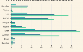
Just how much are we investing in our pets? This post takes a look at current household spending and pet service sector growth between 2007 and 2017.
An overview of how ischemic heart and vascular disease — the state's No. 1 killer — affects Atlantans today and how its impact has changed over time.
Take a look at how labor force participation rates among different age groups today compare to the year 2000 as well as how representation of different age groups in the workforce has changed over time.
Neighborhood Nexus' 100 Metros Dashboard makes it easy to find general data about the Atlanta MSA and compare it to the country's other largest 100 metro areas.
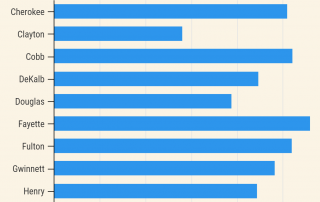
An overview of average household spending on recreation and fitness equipment in ARC's 10-county area.
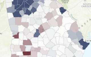
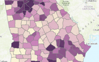
A series of static maps and an interactive tool exploring population change throughout the state.
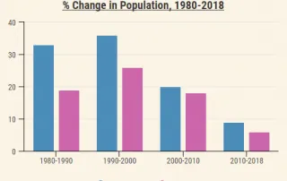
Examining population change in the 10-county area since 1980, including absolute population change, percent change and changes in density.
This Monday Mapday considers both our residents who do not speak English inside the home as well as residents who do rate themselves as speaking English less than very well.