Friday Factday: Income and Perceptions of Life in Atlanta
A look at how differences in income are related to differences in our opinions and beliefs about life in Atlanta, with a focus on housing affordability and workforce development.

A look at how differences in income are related to differences in our opinions and beliefs about life in Atlanta, with a focus on housing affordability and workforce development.
A series of maps comparing percent point change in white and black residents at the county and tract level, followed by a map explorer tool with additional data.
A look back at how metro Atlanta's diversity has grown and changed since 1980.
An overview of the retail sector in the 10-county metro area, looking at common areas of consumer spending as well as retail jobs.
A dive into differences in unemployment rates based on education, sex and age.
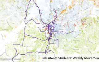
Two maps — one showing college students' movement and another showing high school students' movement over the course of a week in Atlanta — offer an idea of just how much of the city these students' might regularly experience.
A collection of highlights gleaned from our recently updated 20-County dashboard.
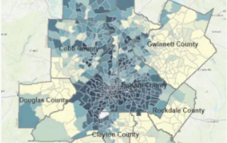
An overview of disparities in homeownership across the metro.
Two statewide maps showing the percent of deaths related to breast cancer and the years of potential life lost due to the disease.
Breast cancer awareness month is upon us. This post considers what percent of state and metro-area deaths are a result of the disease, as well as how much it contributes to premature death and racial disparities in this worst-case outcome.