
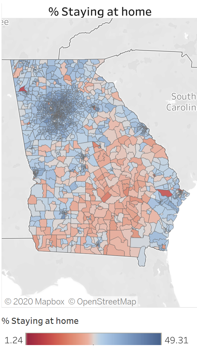
When we last examined social distancing in Georgia as measured by levels of cell phone movement, we saw that a lot of things in the state changed the week of March 16th. Before that, most use patterns indicating that people were staying home were concentrated in the Atlanta area. But that week the high shares of residents staying at home extended to most of the rest of the state.
We’ve now updated the data through the week of May 25, allowing comparisons before, during and after the state’s shelter-in-place order occurred. The three maps below, taken from our updated dashboard, represent how things changed during the three different time periods.
A few examples of insights we can glean from these maps:
- Throughout the entire time period, the largest shares of people staying at home (blue shading) were in the Metro Atlanta area.
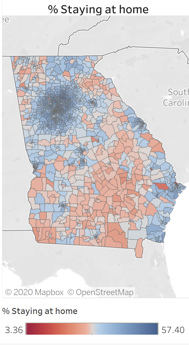
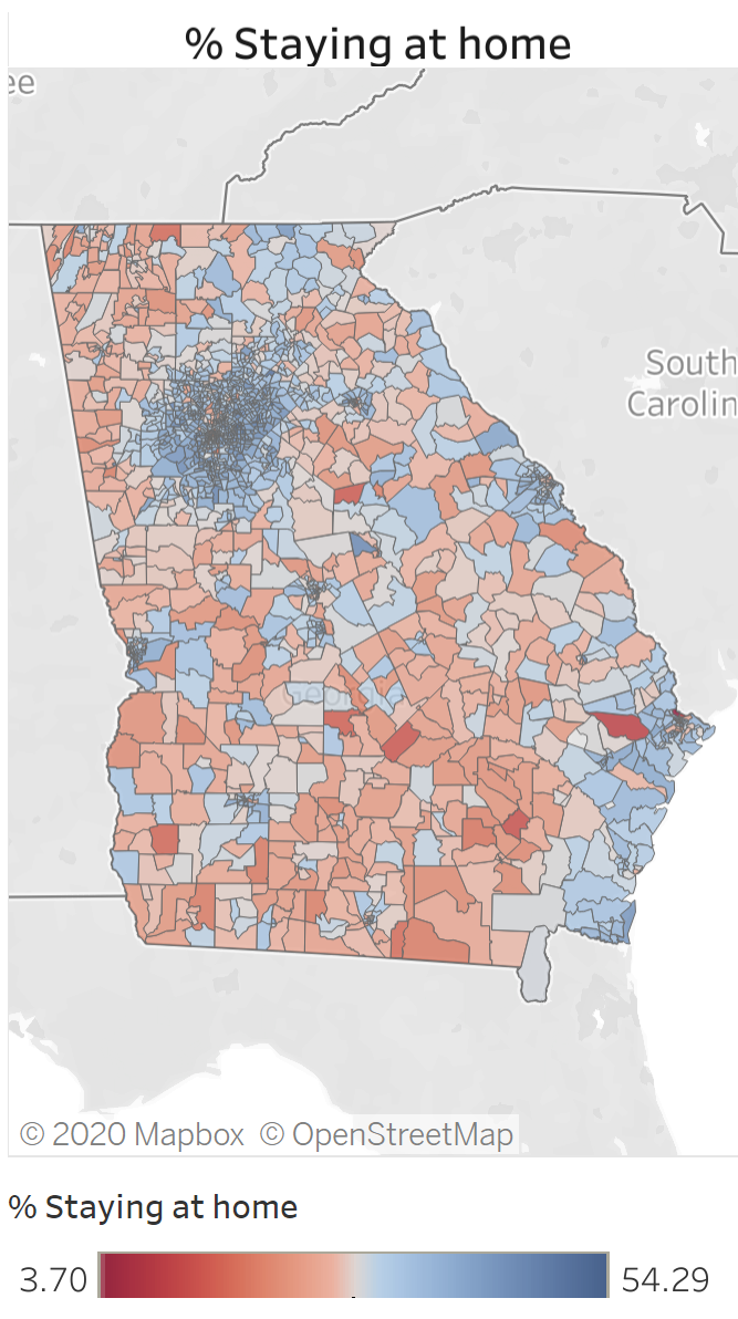
- Before the shelter in place order, the highest share of residents staying at home (in any given census tract) was 49%. During the timespan of the shelter- in-place order, the highest percentage staying home was 57%. Near the end of May, the maximum was 54%. This could indicate that in areas where people are choosing to stay home, they’re continuing to do so at a higher rate (after the shelter-in-place order was lifted) than they were before the shelter-in-place order was in effect.
- The above observation is tempered, however, with a look at the week of May 25 map, which shows that many census tracts have converted from high rates of residents staying at home (blue shading) to lower rates of residents staying at home (red shading).
Week of March 16, 2020
Week of April 13, 2020
Week of May 25, 2020
Be sure to check out the original post for more on the dashboard and how to use it. Data come from SafeGraph, which uses a panel of GPS pings from anonymized mobile devices.