
Monday Mapday
Maps showing themes and trends, published on Mondays

Monday Mapday: Housing Affordability
This map compares housing affordability in the 100 largest U.S. metros. One way to measure housing affordability is to consider the percentage of income that is spent on housing costs. Housing is generally considered unaffordable when housing [...]
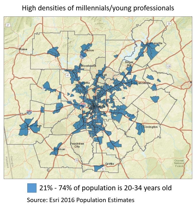
Monday Mapday: Showing our Age
Our recent special feature Showing Our Age used Esri 2016 Population Estimates data to analyze age trends in metro Atlanta. These maps use the same data for a 20-county region to show spatial patterns in concentrations of millennials/young [...]
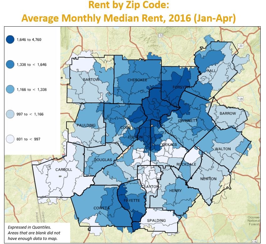
Monday Mapday: Rent by Zip Code
This zip code map is a preview of the upcoming Regional Snapshot on home prices in metro Atlanta. This map shows the average monthly median rent using the Zillow Rent Index measure over a four month [...]
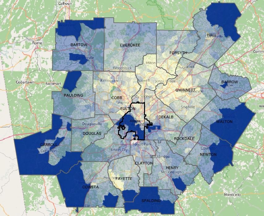
Monday Mapday: Georgia-Born
The places in metro Atlanta with the highest percentages of people who were born in Georgia are primarily in the suburbs, with an additional pocket in central Fulton County. In the blue areas highlighted on this [...]
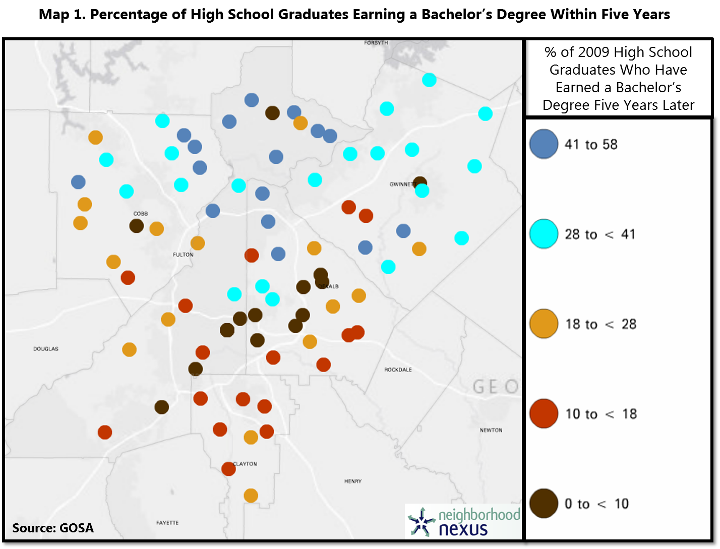
Monday Mapday: 2009 High School Graduates with Bachelor’s Degrees
This map, from our special feature So What Exactly Happens After High School?, uses data from the Governor’s Office of Student Achievement (GOSA) (mapped using Neighborhood Nexus) shows, by school, the percentage of 2009 high school graduates (for most high [...]
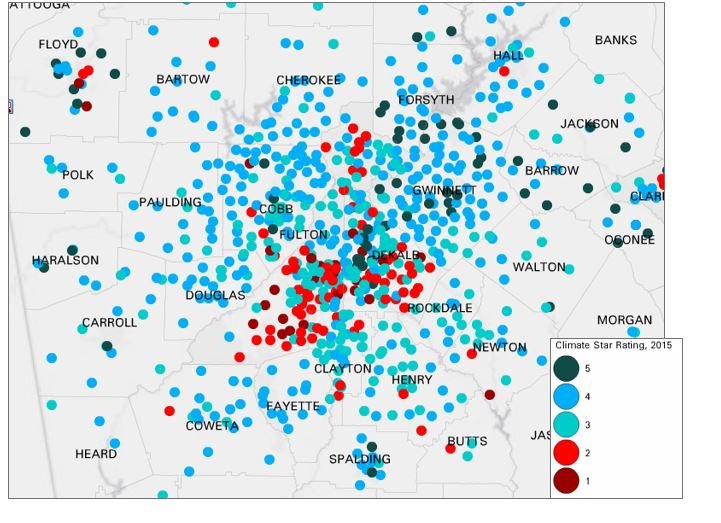
Monday Mapday: School Climate Ratings
To start off this week, we wanted to take a look at the newly released School Climate Ratings- a rating system derived from surveys distributed to all schools in Georgia. The ratings aim to assess [...]