
Monday Mapday
Maps showing themes and trends, published on Mondays

Monday Mapday: Cost-of-Living Index
Taken from this month's Regional Snapshot, this map explores cost-of-living across the largest metropolitan areas in the United States. Red and green dots mark the cities with a lower cost- of-living index while blues indicate the highest. As [...]

Monday Mapday: Georgia House Districts
Our interactive Georgia House and Senate district maps can help you better understand your district by mapping about 300 variables throughout the state. For example, this map shows the percentage of owner-occupied housing units by [...]
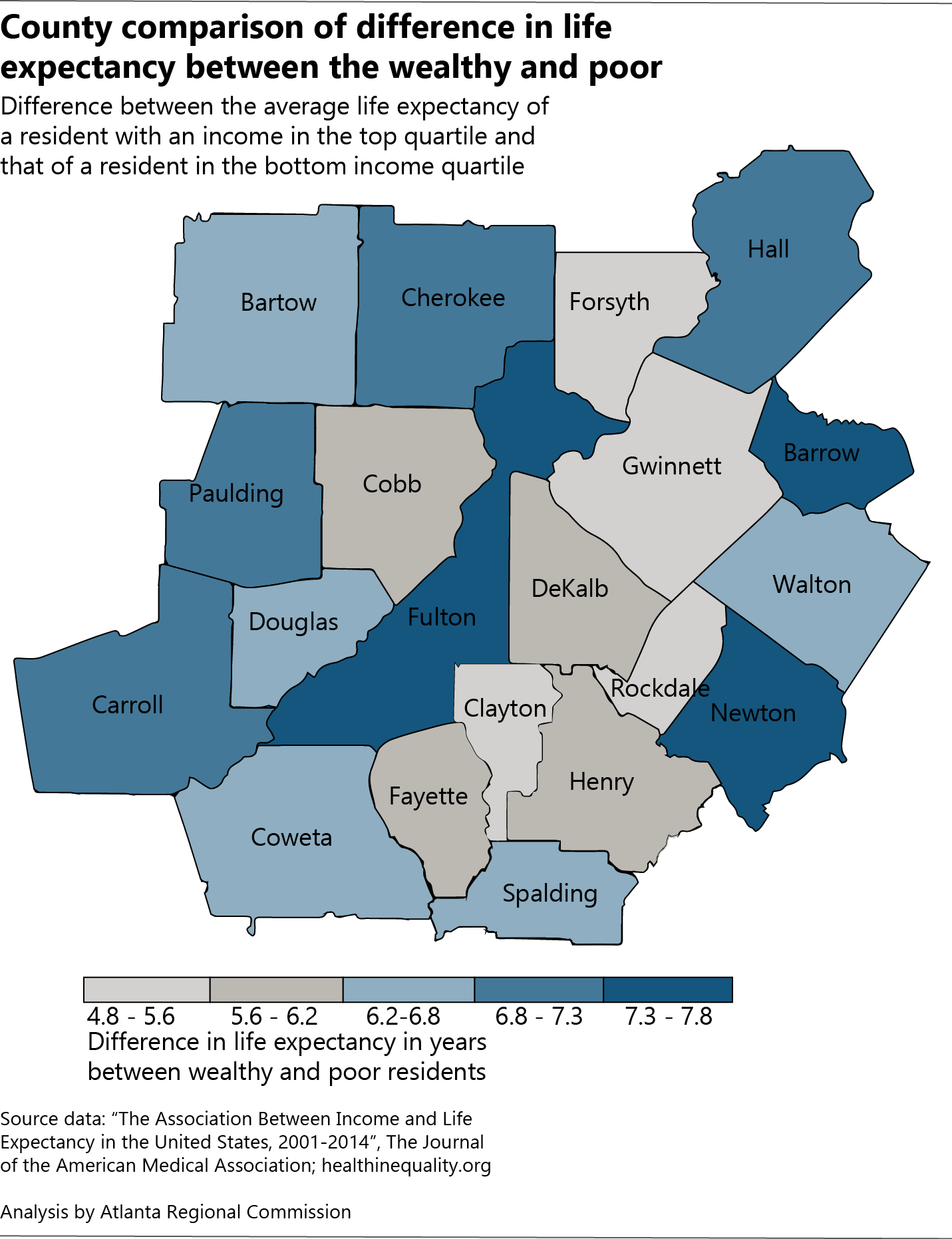
Monday Mapday: County-level disparities in life expectancy
This map from our feature on Life expectancy for low-income residents in metro Atlanta uses data from The Health Inequality Project study to show the difference in life expectancy between high- and low-income metro Atlanta residents by county. On [...]
Monday Mapday: Air Quality in Metro Atlanta
Through the Atlanta Roadside Emissions Exposure Study (AREES), Atlanta Regional Commission can evaluate air pollution at the neighborhood level. These maps show particulate matter (PM) concentrations coming from the transportation system. PM levels are higher [...]

Monday Mapday: 2014-2015 Employment Change by Metro
This map shows the top 100 largest metros in the U.S symbolized by the percent change in employment from 2014-2015. The metros with green circles had the greatest increase; metro Atlanta falls into [...]
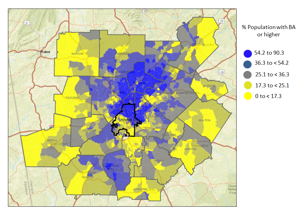
Monday Mapday: Metro Atlanta population with a Bachelor’s degree or more
In keeping with last week’s Monday Mapday, we are continuing to assess educational outcomes throughout metro Atlanta. Last week’s map showed 3rd grade reading proficiency, so this week we wanted to show the percentage of people [...]