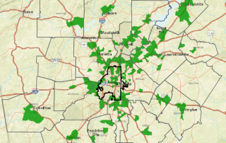
Monday Mapday: 2014-2015 Employment Change by Metro
This map shows the top 100 largest metros in the U.S symbolized by the percent change in employment from 2014-2015. The metros with green circles had the greatest increase; metro Atlanta falls into this group with an increase of 2.9% for the one-year period. To explore this interactive map and 500 other variables [...]