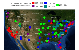
Monday Mapday: Housing Affordability
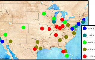
This map compares housing affordability in the 100 largest U.S. metros. One way to measure housing affordability is to consider the percentage of income that is spent on housing costs. Housing is generally considered unaffordable when housing costs exceed 30% of income. The colored circles on the map represent the metro areas and indicate what percentage of housing [...]