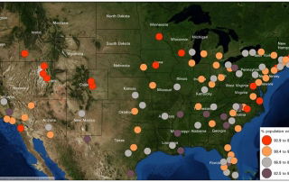
Monday Mapday: 100 Metros by Gross Domestic Product
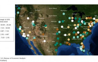
This map compares the 100 largest metros by their percent change in Gross Domestic Product (GDP) from 2010-2014. Metro Atlanta is in the second highest class, with a 7.72% increase in GDP (using 2009 dollars). You can explore this map and others by visiting the 100 Largest Metros interactive map on Neighborhood Nexus. [...]