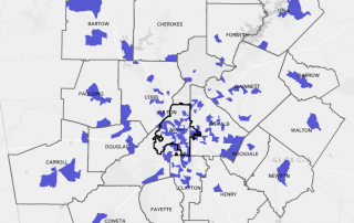
Monday Mapday: Patents Filed
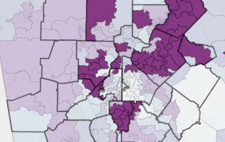
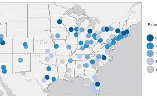
Trends in patents are a leading indicator for higher-wage job growth. When there are high amounts of patents filed, it suggests that people are innovating, creating, and starting businesses. This map shows the number of patents filed per 100,000 people in 2015. Dark blue represents the highest rates and light blue/ grey represent the lowest. Atlanta [...]