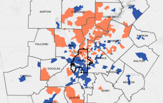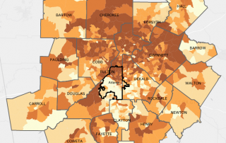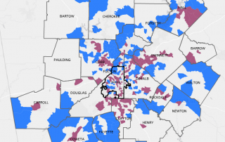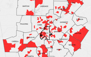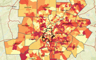
Monday Mapday: Georgia House Districts + Health Insurance
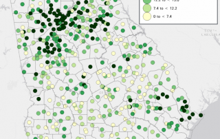
With today being the start of Georgia's 2017 Legislative Session, let's take a quick look at one topic that is sure to be discussed- health insurance. In Georgia, 13.9% of people do not have health insurance coverage (U.S. Census Bureau American Community Survey 2015 1-Year Estimates). This map shows the percentage of population that [...]