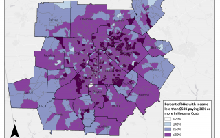
Monday Mapday: Metro Housing Affordability Challenges
If you live in a household in the Atlanta Metro region which makes less than $50k a year, chances are that 30% or more of your household income is going to pay either your rent or your mortgage. The map below, by census tract, shows those areas with the greatest affordability challenges in dark [...]