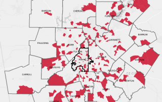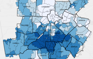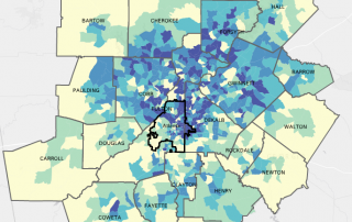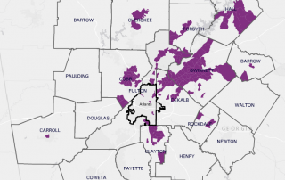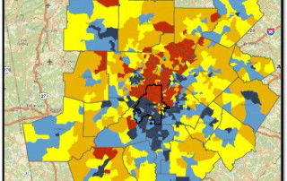
Monday Mapday: Location of Low-Income Workers vs. Low-Income Jobs
The maps below show a spatial mismatch between the location of low-income workers and low-income jobs. The first map shows the location of the region’s low-income workers by place of residence, with blue shades representing areas with the highest concentration of low-income workers. As depicted in the map, the region’s low-income workers are primarily [...]