Monday Mapday: PPP Loans in the Metro
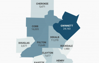
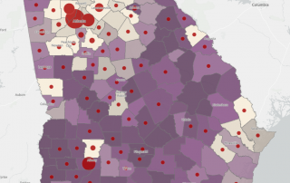
Looking at the spatial distribution of Paycheck Protection Program loans below and above $150,000.

Looking at the spatial distribution of Paycheck Protection Program loans below and above $150,000.
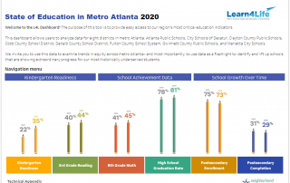
Learn4Life's interactive data dashboard enables research about student achievement and growth in the five-county area's eight school districts.
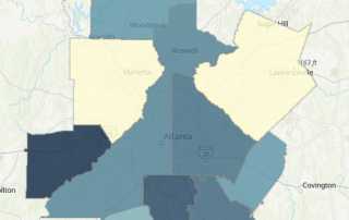
This Monday Mapday explores the location of students whose learning needs may be most impacted by virtual instruction.
In honor of the 30th anniversary of the Americans with Disabilities Act, this Monday Mapday takes a look at the rates of disabled Americans at the county and tract level.
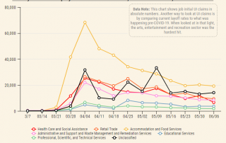
With case numbers continuing to rise, the economic impact of COVID-19 continues to grow. This post's interactive maps overlay cases by county with measures of economic vulnerability.
A look back at how metro Atlanta's diversity has grown and changed since 1980.
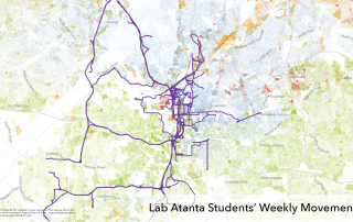
Two maps — one showing college students' movement and another showing high school students' movement over the course of a week in Atlanta — offer an idea of just how much of the city these students' might regularly experience.
How does Georgia stack up when it comes to shares of Native American and Alaska Native peoples? These maps take a look at these shares, by tract and county, across the country and the state.
Some encouraging data on recent trends in formation of, employment at, and revenue produced by women-owned businesses.