Tax Day Countdown: Earned Income Tax Credit by Metro

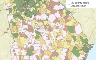
This map shows total population change by zip code throughout Georgia from 2010-2015. The zip codes in green have had the greatest amounts of population growth while areas in pink have seen a loss in population. The majority of zip codes in the 20-county metro Atlanta region have seen large increases in population.
Want to know how Atlanta's economy held up during 2015's final quarter? Scroll through "The Quarter" to see the highlights and interactive charts below! Or you can visit "The Quarter" on the ARC's website here.
Hartsfield-Jackson Atlanta International Airport has been the world’s busiest passenger airport since 2000 and still is today. Most passengers are domestic, by a large margin. However, a greater percentage of freight is international. This interactive dashboard from the Atlanta Regional Transportation Factbook provides information on aircraft operations, passengers, and freight and mail activity for 2011-2015. [...]
The countdown to Tax Day is on! In honor of the countdown, this map shows the change in the percentage of tax returns claiming the Earned Income Tax Credit (EITC) from 2011-2013 by zip codes in metro Atlanta. The EITC is one of the most effective tools for lifting low-income working families out of poverty [...]
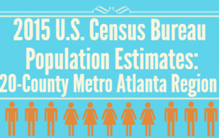
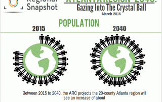
It is Snapshot time, and this month we are covering the forecasts recently completed as part of The Atlanta Region's Plan, which is a long-range comprehensive plan that includes a vision for how the region might accommodate a population of just over eight million people by 2040. Therefore, this Regional Snapshot will unpack those forecasts [...]