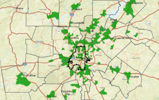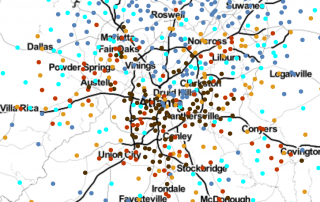
Monday Mapday: Georgia Milestones Assessment
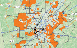
Many Georgia schools are taking the 2016 Georgia Milestones Assessments this week, so we decided to take a look at last year's assessments for 3rd grade English Language Arts (ELA). This map shows public schools in metro Atlanta symbolized by the percent of 3rd graders who were designated "Proficient Learner" and above for the end-of-grade ELA [...]