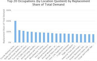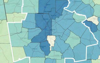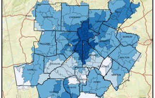
Monday Mapday: Time Spent Online
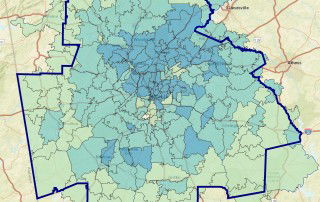
This week's Monday Mapday explores time spent online in the Atlanta metropolitan statistical area (MSA). The map below shows the percentage of the adults,* by zip code, that spent an average of 2 to 4.9 hours online in a typical day. Areas shaded in dark blue (including areas of Cherokee, Cobb, DeKalb, Fayette, Forsyth, [...]