

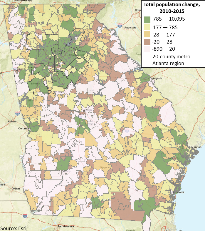
Monday Mapday: Georgia’s Population Change by Zip Code
This map shows total population change by zip code throughout Georgia from 2010-2015. The zip [...]

It is time to check in on the state of Atlanta’s economy!
Want to know how Atlanta's economy held up during 2015's final quarter? Scroll through [...]

Transportation Tuesday: Hartsfield-Jackson Airport Usage
Hartsfield-Jackson Atlanta International Airport has been the world’s busiest passenger airport since 2000 and still [...]

Monday Mapday: Earned Income Tax Credit (EITC)
The countdown to Tax Day is on! In honor of the countdown, this map [...]
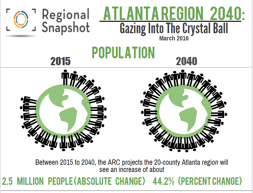
Atlanta Region 2040: Gazing Into The Crystal Ball
It is Snapshot time, and this month we are covering the forecasts recently completed [...]

Transportation Tuesday: Transit Ridership
Transportation Tuesday this week looks at transit ridership data in metro Atlanta. This interactive dashboard, [...]

Monday Mapday: Change in Employment Density 2015-2040 (ARC Series 15 Forecast)
Last week's Monday Mapday looked at the ARC 2015-2040 population forecast for change in population density [...]