


Data Diversion: From Olmstead to COVID-19
COVID-19 cases in nursing homes are on the rise, and a Supreme Court decision from 1999 provides the groundwork for getting people out of an institutionalized setting and into their homes, where they can engage in better social distancing and safety from the virus.

COVID-19 Weekly Report: June 26, 2020
The latest information on new cases and economic impacts in ARC's 10-county area.

COVID-19 Weekly Report: June 19, 2020
The latest information on new cases and economic impacts in ARC's 10-county area.

COVID-19 Weekly Report: June 12, 2020
The latest information in new cases and economic impacts in ARC's 10-county area.

Data Diversion: COVID-19 Impacts on Expenditures of Low-Income Georgians
This post looks at pandemic impacts on the spending of lower-income metro residents.
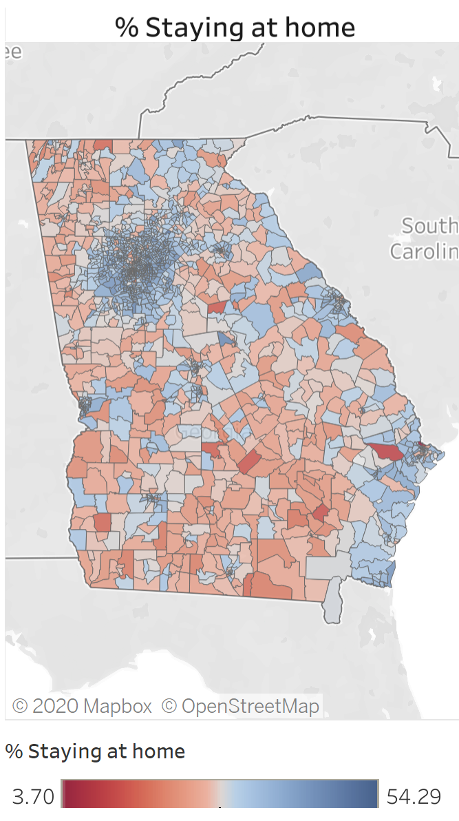
Monday Mapday: Update to Social Distancing Data
An update to our social distancing dashboard, using data from the month of May.

COVID-19 Weekly Report: June 5, 2020
The latest information in new cases and economic impacts in ARC's 10-county area.

Data Diversion: Update to Mobility by County
Travel within the region had a marked decline (for good reason) during the statewide shelter-in-place order. This post explores what's happened to local travel since Georgia's reopening.

COVID-19 weekly reader: May 29, 2020
A look at data describing the effects of COVID-19 on Metro Atlanta.