Finding the Cooling Gaps in a Hot City
Extreme heat doesn't hit every neighborhood the same, and now we can map where vulnerability is highest.



Extreme heat doesn't hit every neighborhood the same, and now we can map where vulnerability is highest.
Metro Atlanta Speaks: The new and improved user-driven experience! A walk through the dashboard
As October is Breast Cancer Awareness Month, it is an appropriate time to ask what level of progress we are making against this disease in Georgia.
For Older Americans Month, the latest data on trends in and planning for the national and Atlanta aging population
Unequal access to healthcare all too often seems to equate to inequitable outcome(s)
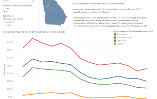
Health Coverage Over Time: Age and Income Make a Difference
The Hads, the Still Haves and Have-Nots on Health Insurance?
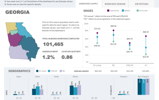
May is National Nurses Month, so today's post highlights an interactive dashboard showing statewide metrics for major categories of the nursing profession.
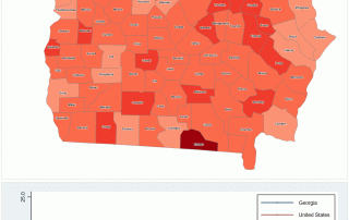
What to expect when looking at life expectancy? First, you'll see wide variation by area, sometimes eve when those areas are not that far apart. Next, anticipate tight correlations (in opposite directions) with lack of health insurance and high poverty rates.
What's the Biggest Problem? How the answers to the biggest question in the Metro Atlanta Speaks Survey have changed over time - and how they haven't.