
You–especially if you’re a reader of this blog– have likely heard the phrase “place matters.” Well, yeah–of course it matters, and it matters in lots of ways. Often, however, when us data geeks use the phrase, we are trying to convey the simple and unfortunate fact that a great many of our outcomes are heavily correlated with where we live. This is certainly true when it comes to life expectancy.
Thanks to a partnership among the National Center for Health Statistics (NCHS), the Robert Wood Johnson Foundation (RWJF) and the National Association for Public Health Statistics and Information Systems (NAPHSIS), we can map neighborhood-level estimates of life expectancy for those born between 2010 and 2015. We won’t go into the methodology in this post, but you can check out CDC’s page about these estimates here.
We recently added these data into our new-ish mapping tool, DataNexus, so now it is very easy to create your own maps showing these neighborhood-level estimates. But, of course, we will make some maps for you here. Figure 1 below shows how life expectancy differs across the 11-county Atlanta region. For some areas, even though they’re physically separated by only a few miles, you’ll see are life expectancy differences of two decades. (Note: the darker the purples, the lower the life expectancy)
Figure 1. Average Life Expectancy
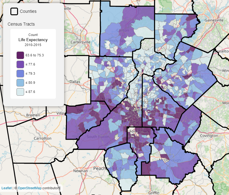
Source: USALEEP; DataNexus
There is a distinct spatial pattern that is all-too-familiar with this map. If you don’t believe me, go to DataNexus and map indicators like household income, educational attainment, poverty, low-birth weight births – to name but a few. You’ll see the same spatial pattern.
Because life expectancy depends on so many other variables, there are a lot of other things that are correlated to life expectancy, as seen below in the two scatterplots. Now, a scatterplot is great because it quickly shows the correlation between two distinct variables. For example, in Figure 2 below, we see that as the poverty rate increases on the X-axis, or the horizontal axis, life expectancy (on the Y-axis) decreases. Now, of course all sorts of caveats apply here, mostly dealing with “correlation is not causation” type arguments, but the general relationship is clear. Higher rates of poverty are associated with shorter life expectancies. We see the same basic patterns (although not as strong) in Figure 3 as well.
Figure 2. Scatterplot Showing Correlation Between Life Expectancy and Poverty
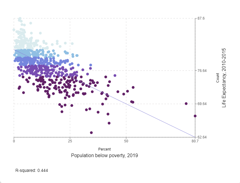
Sources: USALEEP; American Community Survey
Figure 3. Scatterplot Showing Correlation Between Life Expectancy and Lacking Health Insurance
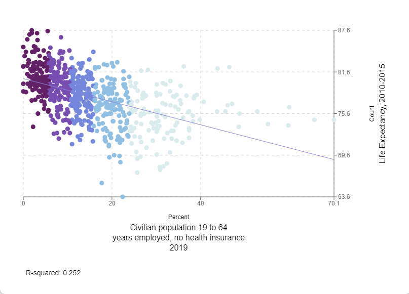
Sources: USALEEP; American Community Survey
We encourage you to create your own maps – it’s so easy with DataNexus – to see similar spatial patterns and how they may correlate to other indicators. I mean, we have over 4,000 indicators in our system, so I bet you’ll find plenty of things to map!
While this post focuses on the latest available small-area or “micro” data, there’s more recent data at the larger, “macro” area. And these data are really interesting, though the headlines are not that encouraging to be honest. National life expectancy has declined in the last part of the 2010s with the onset of the opioid crisis, fell more in 2020 with COVID impacting the trend, and has continued to fall in 2021. Finally, for an in-depth policy planning look at life expectancy, as well as more exploration of local data, we recommend you check out ARC’s Aging and Independent Services Group’s Living Beyond Expectations (LBE) Regional Strategic Plan.