
In three recent blog posts, we have compared metro Atlanta’s recent growth to other major metros; examined population change components to explain differences between major metros; and zoomed in to the county level to see growth patterns among metro Atlanta counties. For the fourth and final post in this series, let’s dig into the components of population change among metro Atlanta’s counties.
A quick reminder about these components: population for an area varies over time through natural change (further subdivided into births and deaths) and migration (further subdivided into domestic and international migration, depending on whether the movement occurs within the U.S. or between the U.S. and another country).[1]
Figure 1 presents components of change for the 29 counties comprising the Atlanta MSA[2] over the 2024-25 period.[3]
Figure 1: Components of Population Change for Atlanta MSA Counties, 2024-25
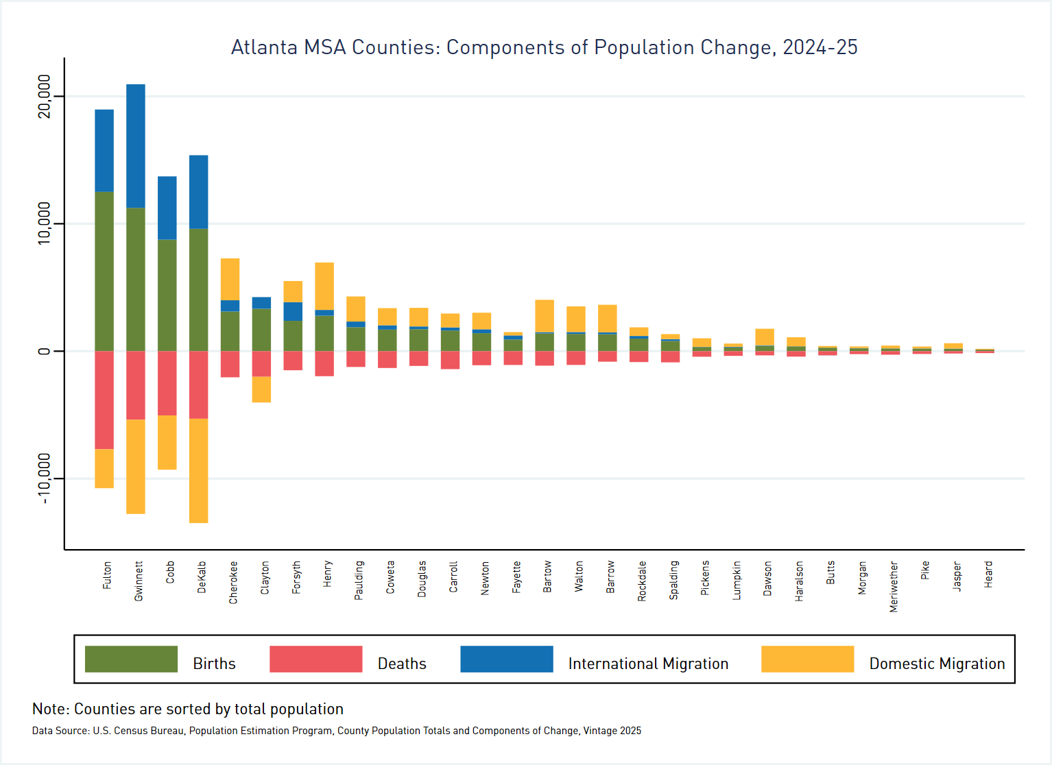
This graph reveals two distinct groupings among our counties.
The first group consists of five of the six largest counties– Fulton, Gwinnett, Cobb, DeKalb, and Clayton– all counties in the core of the region. Every county in this first group experienced negative domestic migration (represented by the gold bars), meaning that more people moved to other U.S. counties than moved in from other places in the United States. But for three of the five in this first group– Fulton, Gwinnett, and Cobb– overall net migration was positive thanks to international migration (symbolized by the blue bars).
The remaining 24 counties in the region, all outside the urban core, make up the second group. These counties all experienced positive domestic migration. But with the exception of Forsyth and Cherokee counties, where international migration made up 46% and 15% of net migration respectively, international migration was only a minor component of population change among counties in this second group.
Differences also emerge between the two groups in terms of natural change. The five counties in the first group all posted positive natural change, meaning that births outnumbered deaths. The story is mixed among counties in the second group: some, like Forsyth County (1.6 births per death) and Henry County (1.4 births per death) had positive natural change; others, like Fayette County (0.8 births for every death) experienced negative natural change.
Where has domestic migration occurred over the last five years? Figure 2 presents net domestic migration over the period 2020 through 2025 as a percentage of 2020 population.
Figure 2: Domestic Migration by County as a Percentage of Population, Atlanta MSA and Vicinity, 2020-25
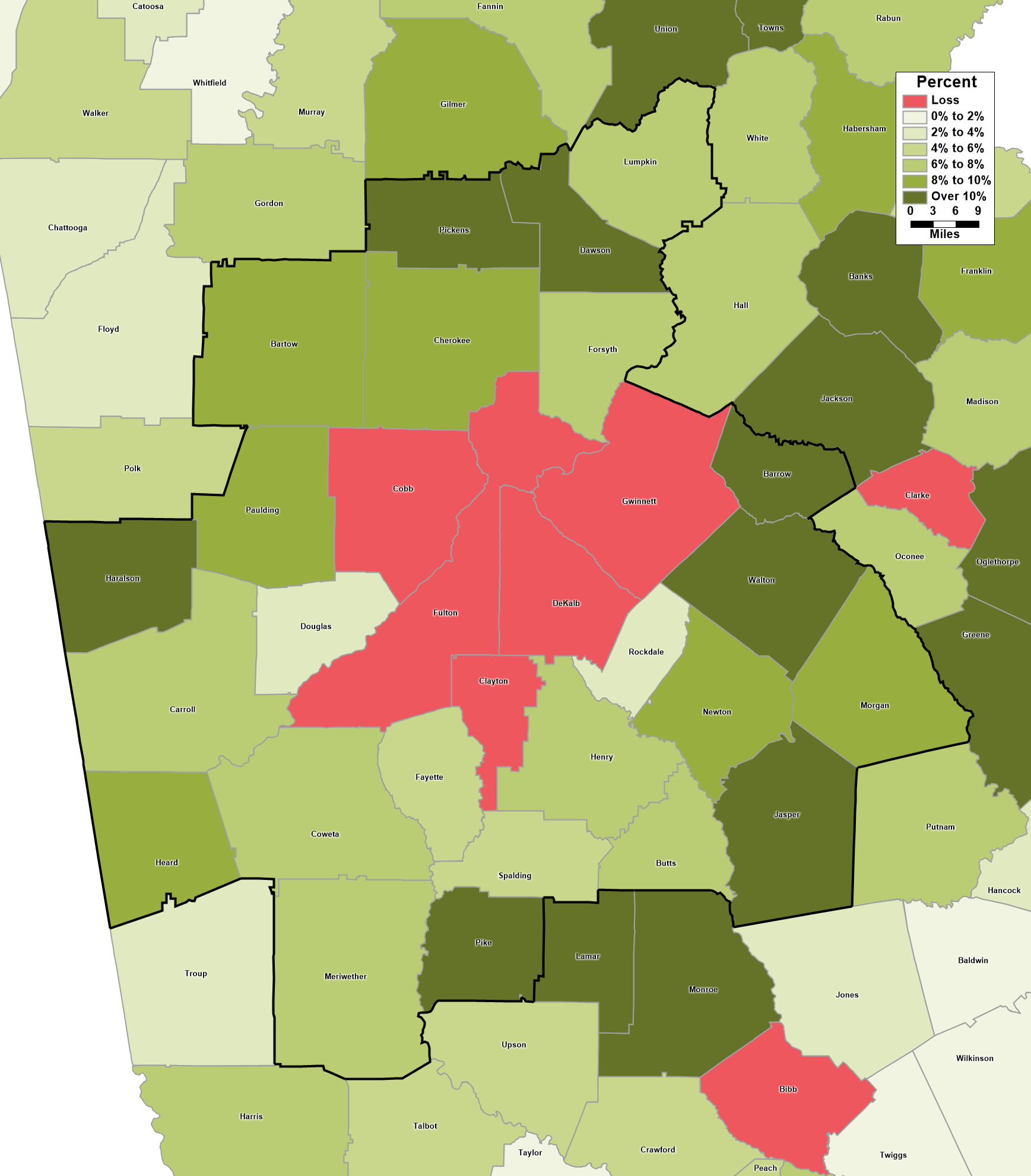
Given the discussion above, it is no surprise that this map shows a spatial pattern that differentiates between the core and periphery of our MSA. Metro Atlanta’s five core counties all lost population to domestic migration for this five-year period– despite the fact that four of these five counties posted strong growth during the same period. Net positive domestic migration, at least on a percentage basis, grows as you move out from the core. Jasper and Dawson Counties had the highest net domestic migration as a percentage of 2020 population, with 20% and 29% respectively.
Just how important has international migration been to the growth of metro Atlanta counties? Figure 3 presents net international migration over the period 2020 through 2025 as a percentage of the 2020 population.
Figure 3: International Migration by County as a Percentage of Population, Atlanta MSA and Vicinity, 2020-25
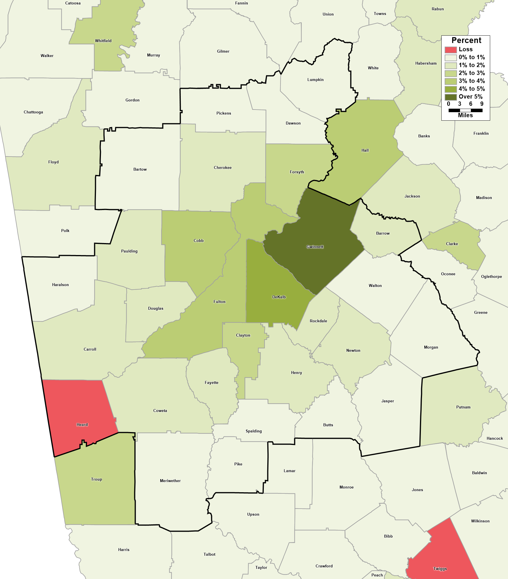
This map presents a picture that is in many ways a mirror image of the previous figure. Gwinnett County has absorbed the greatest international migration over the five-year period, a number amounting to about 5.5% of the county’s 2020 population. DeKalb (4.3%), Cobb (3.6%), and Fulton (3.1%) form a second tier, followed by Forsyth (2.7%) and Clayton (2%) counties. The importance of international migration tails off as we move into the periphery of the MSA. Indeed, Heard County on the Alabama border experienced net negative international migration over the 2020-25 period.
As we noted when discussing components of change among major metros, changes in national immigration policy have resulted in sharp drops in international migration nationwide. How does that look among counties in metro Atlanta? Figure 4 compares net international migration between the 2023-24 and the 2024-25 periods; for the sake of legibility, this graph is limited to the nineteen counties that had gained at least 100 people via international migration in the 2023-24 period:
Figure 4: Comparing International Migration by County, 2023-24 vs. 2024-25
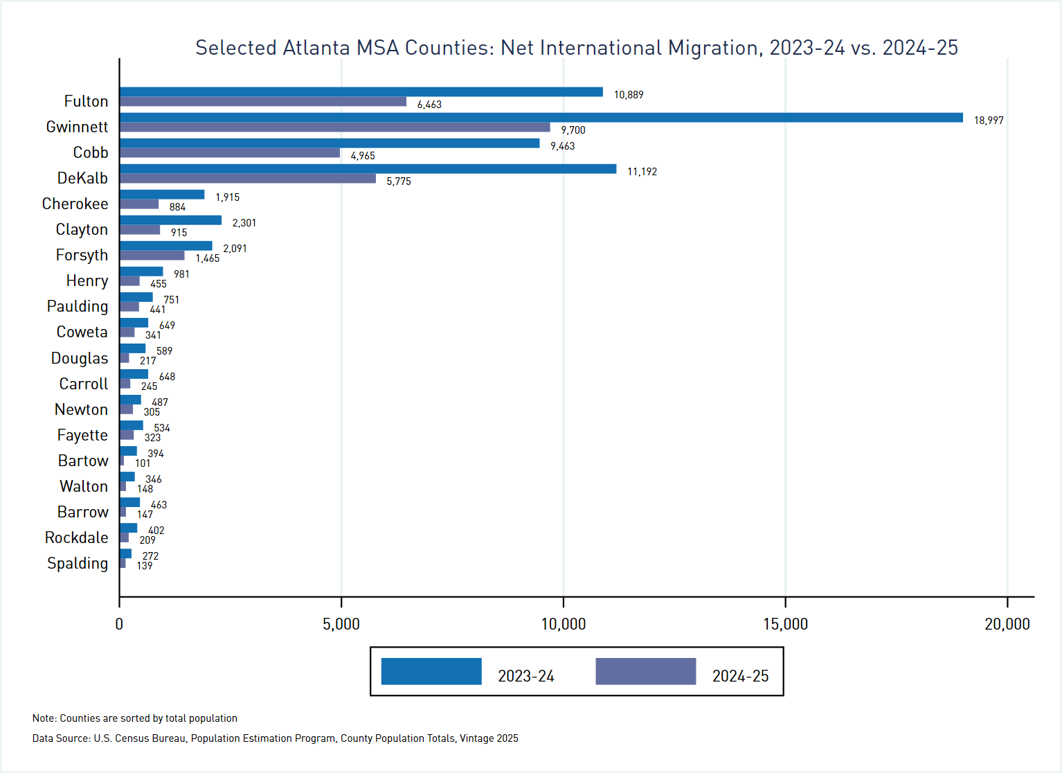
International migration was down sharply across the board. Among counties included in the graph, Forsyth County had the smallest percentage drop, with 30% less net international migration in 2024-25 than in the year prior. Bartow County had the largest percentage decrease, at 74%, while Gwinnett County saw the largest change in absolute terms: a decline of 9,297, or about 49%.
It is worth again noting that the population estimates date to July 1 of each year, meaning that these data account for only the first several months under these new immigration policies. We will have a better picture of the impact of changed immigration policies when the 2026 estimates become available.
Notes:
[1] The population estimates also include a small residual category, basically designed to ensure that totals for smaller geographic units sum up correctly to larger geographic units.
[2] AKA the Atlanta-Sandy Springs-Roswell, GA Metropolitan Statistical Area.
[3] Population estimates are for July 1 of each year, so these measures represent change between July 1, 2024 and June 30, 2025.
Access the data utilized in this blog post: Georgia County Population Change and Components, Vintage 2025