
We recently observed that while population growth slowed in the United States between 2024 and 2025, the Atlanta Metropolitan Statistical Area (MSA)[1] outpaced the country and most other top metros[2] in terms of growth. This moved metro Atlanta up to number six in the population rankings. What are the drivers of different growth patterns around the country?
Before getting into the data, let’s review some terminology. The population of an area is always changing: people are born, people die, people move in, and people move out. The Census Bureau refers to births and deaths collectively as “natural change,” while moves in and out make up “net migration.” The Census Bureau further differentiates between domestic migration– moves within the country– and international migration– moves between the United States and other countries.[2] Note that the question of domestic vs. international migration concerns the location and not the national origin of the person. By way of illustration, the City of Clarkston in DeKalb County has long welcomed refugees as they resettle in the United States. When a refugee would first move to Clarkston, it would count toward DeKalb County’s international migration number. But when that same person finds a job and moves to another county, that is counted as negative domestic migration for DeKalb and positive domestic migration for this person’s new home county. Because domestic migration is movement within the country, net domestic migration for the country as a whole is always zero by definition.
Figure 1 breaks population change between July 2024 and 2025 into its various components for the country’s 20 largest metropolitan areas.
Figure 1: Components of Population Change for top 20 Metros, 2024-25
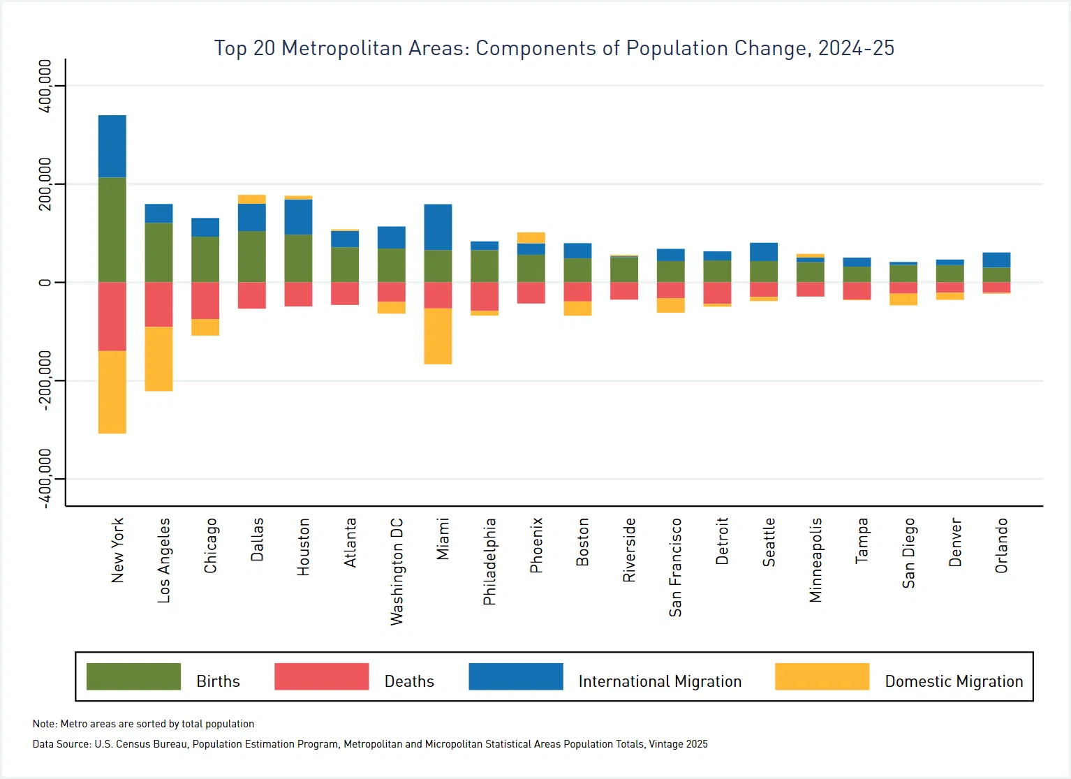
As this graph shows, all of the top metros had net positive natural change with one exception: the Tampa-St. Petersburg-Clearwater, FL MSA had about 2,900 more deaths than births.[3] The top 20 metros all had net positive international migration, but 14 of the top 20 had net negative domestic migration.[4] Of these 14, six had net negative total migration: New York, Los Angeles, Miami, San Francisco, San Diego, and Denver. Among these, New York, San Francisco, and Denver had enough natural increase to outweigh losses due to migration. That leaves Los Angeles, Miami, and San Diego in the red, as noted in the previous post.
It is also worth noting that metro Atlanta moved back into positive territory in terms of net domestic migration after posting a loss in 2023-24. While the Atlanta MSA picked up only about 3,000 people this way, this number was sufficient to cancel out the loss in domestic migration from the previous year.
What if we take a step back and look at a longer timeframe? Figure 2 presents population change by component for the five-year period 2020-25.
Figure 2: Components of Population Change for top 20 Metros, 2020-25
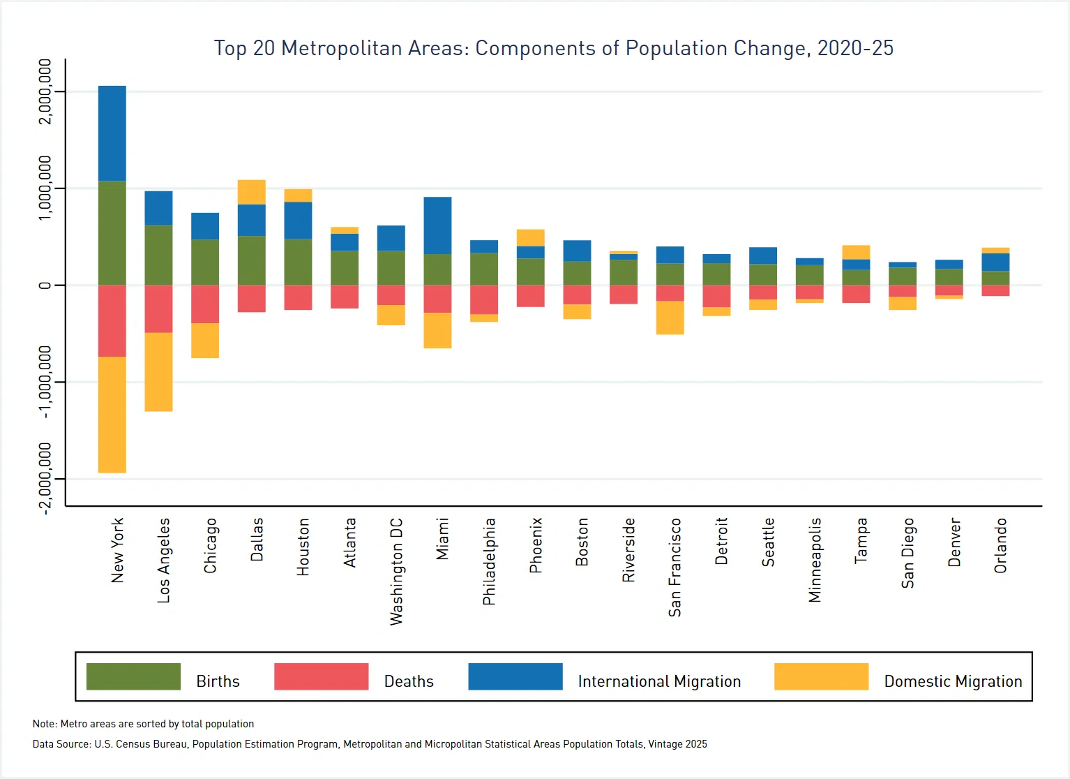
This graph looks quite similar to the figure above, but also with some noteworthy differences. First, the migration bars are shorter in Figure 1 than in Figure 2 relative to the bars related to natural change. This means that movement of people between regions was slower in 2024-25 than in 2020-2024. Even the population magnets of Dallas and Houston seem to be slowing down. In all but three metros, net domestic migration over 2024-25 was the same direction (positive or negative) as for the full five-year period. Minneapolis was negative for the five years but positive for the last year, while Tampa and Orlando had positive domestic migration for the five-year period but posted negative numbers for 2024-25.
Finally, given policy changes related to immigration, it is worth taking a closer look at international migration. Figure 3 compares net international migration for 2023-2024 and 2024-2025[4] for each of the top metros:
Figure 3: Change in Net International Migration, 2023-24 vs. 2024-25
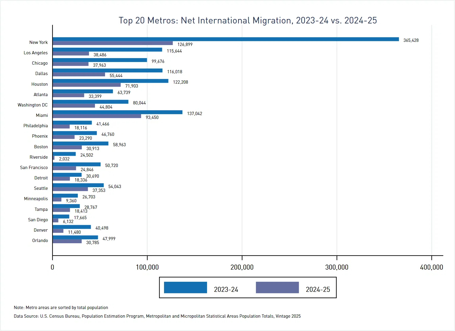
We see here that international migration, a key driver of growth for top metros (and the nation as a whole) dropped off considerably between 2023-2024 and 2024-2025. This is a change worth watching, as it will reverberate through the job markets, housing markets, and other key aspects of life in metro areas.
How does population change and its components play out locally? We’ll take a deeper dive to examine county-level data in a future post.
Notes:
[1] The full name of the Atlanta MSA is the Atlanta-Sandy Springs-Roswell, GA Metropolitan Statistical Area, in recognition of the fact that the region has multiple population cores.
[2] The Dallas and Houston metro areas continued their strong growth into 2025, eclipsing other top metros.
[3] According to the most recent American Community Survey data (2024 1-year release), the median age for the Tampa MSA is 42.2, making it the oldest among the top 20 metros. By way of comparison, the median age for the Atlanta MSA is 37.7.
[4] Keep in mind that population estimates are for July 1 of each year. Thus, the 2024 numbers reflect migration between July 1, 2023 and June 30, 2024, while the 2025 data represent migration between July 1, 2024 and June 30, 2025.
Access the data used in this blog post: Population Change and Components, Top 20 Metros, 2020-2025