Regional Snapshot: Household Composition in Metro Atlanta
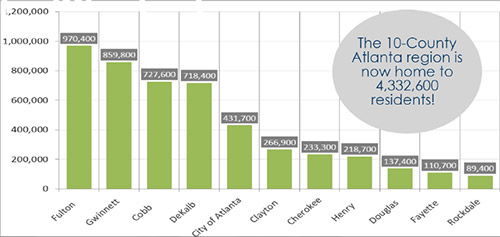
The structure of the family in the Atlanta region has changed dramatically over the past 40 years. There are fewer husband-wife families and more single-parent families and “non-families.” Here are some other key findings from this month’s Regional Snapshot: As of 2010, almost 34 percent of families with children are headed by a single-parent in [...]