
Monday Mapday
Maps showing themes and trends, published on Mondays

Monday Mapday: Internet Access in the Time of Coronavirus
COVID-19 has led to dramatic shifts in our professional and ecucational lives. Far more workers telecommute in this "Corona World", and almost all students have to attend classes remotely. But this "remote world" is not as readily available to all of us. The maps in this post show shares of households wiith internet access (and conversely, those without), along with the shares of resident workers employed in office jobs to which they could likely telecommute.

Monday Mapday: COVID-19 and Cardiovascular Disease
With numbers of diagnosed COVID-19 cases and related deaths continuing to rise, it is ever more critical to identify and mitigate risk factors for the disease.. Cardiovascular health has recently emerged as a risk factor for heightened severity of, and worse outcomes for, coronavirus infections. Maps here show an overlay of current cases with relative concentrations of serious cardiovascular issues, for all ages and for those aged 65 and up.

Monday Mapday: COVID-19: Economically Vulnerable Groups
With case numbers continuing to rise, the economic impact of COVID-19 continues to grow. This post's interactive maps overlay cases by county with measures of economic vulnerability.

Monday Mapday: Older Adults–A Group Vulnerable to COVID-19
As we've all heard, our older adults have high vulnerability to coronavirus. This post provides some interactive maps that take a look at how our 65+ and 85+ populations are distributed across the state, in absolute and percentage terms.
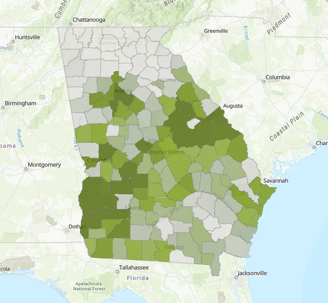
Monday Mapday: The Distribution of Georgia’s Black, Non-Hispanic Residents
Interactive maps taking a look at how our black, non-Hispanic population is distributed across the state today and how things have (or haven't) changed since 2000.

Monday Mapday: Disconnected Youth
This Monday Mapday considers disconnected youth ages 16 to 19 in the 21 County Metro Area.