
Monday Mapday
Maps showing themes and trends, published on Mondays
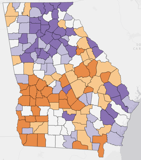
Growing or Slowing? Population Change in Georgia’s Counties (2016 numbers)
The most recent county-level data from the Census Bureau (2016 Population Estimates, released last week) allow us to analyze ttrends in county, metro, and state population numbers. A new article from Governing shows that [...]
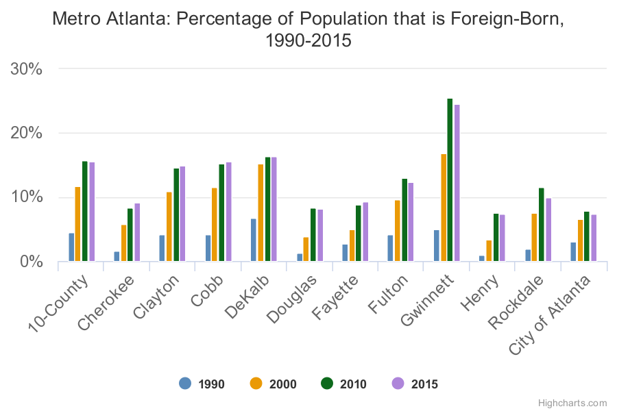
Foreign-Born Population: A Kick-Off to ARC’s Global Advisory Panel
As part of the kick-off for Atlanta Regional Commission’s New Voices: Global Advisory Panel we are sharing updated data about trends in the foreign-born population for metro Atlanta. These charts serve as an introduction [...]
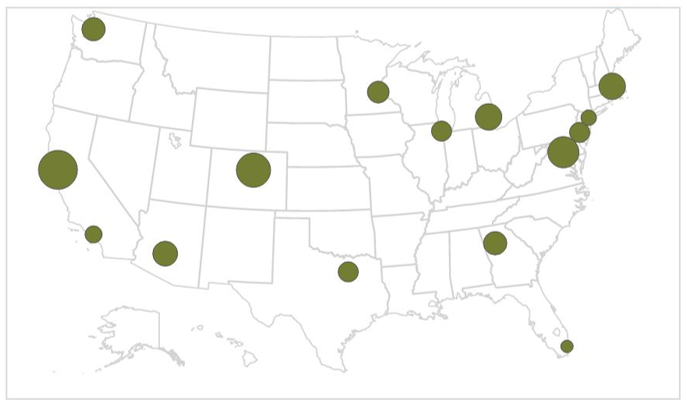
Monday Mapday: Top 15 Hiring Regions for Digital Skills
Our recent Regional Snapshot: Digital Skills- Through the Burning Glass uses Burning Glass Labor Insight data to assess job postings seeking general digital and advanced digital skills– at national, peer metro, and Atlanta metro levels. [...]

Monday Mapday: Poverty in Georgia Cities
In the 10-county metro region, 15.8 percent of the population lives below the poverty line (see the income tab on the 20-County Data Dashboard, 2011-2015 American Community Survey 5-Year Estimates). Using the Georgia Cities [...]

Monday Mapday: Residents Age 18-64 with a Disability
Through the Neighborhood Nexus interactive Georgia State Senate map, you can find a variety of demographic and socioeconomic variables for senate districts. In Georgia, 19 percent of residents age 18-64 have a disability. The [...]
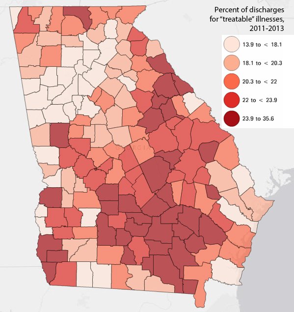
Monday Mapday: A Look at Chronic Health Conditions
This map shows the percentage of discharges for “treatable” illnesses by county for 2011-2013 from the Georgia Department of Public Health OASIS system. The "treatable" illnesses displayed in this map are officially know as Ambulatory [...]