
Monday Mapday
Maps showing themes and trends, published on Mondays

Monday Mapday: What areas have added the most educated residents?
In our recent Regional Snapshot: What have We Learned About Educational Attainment? we look at the change in the past decade in the percentage of the population that has a bachelor's degree or higher in the [...]
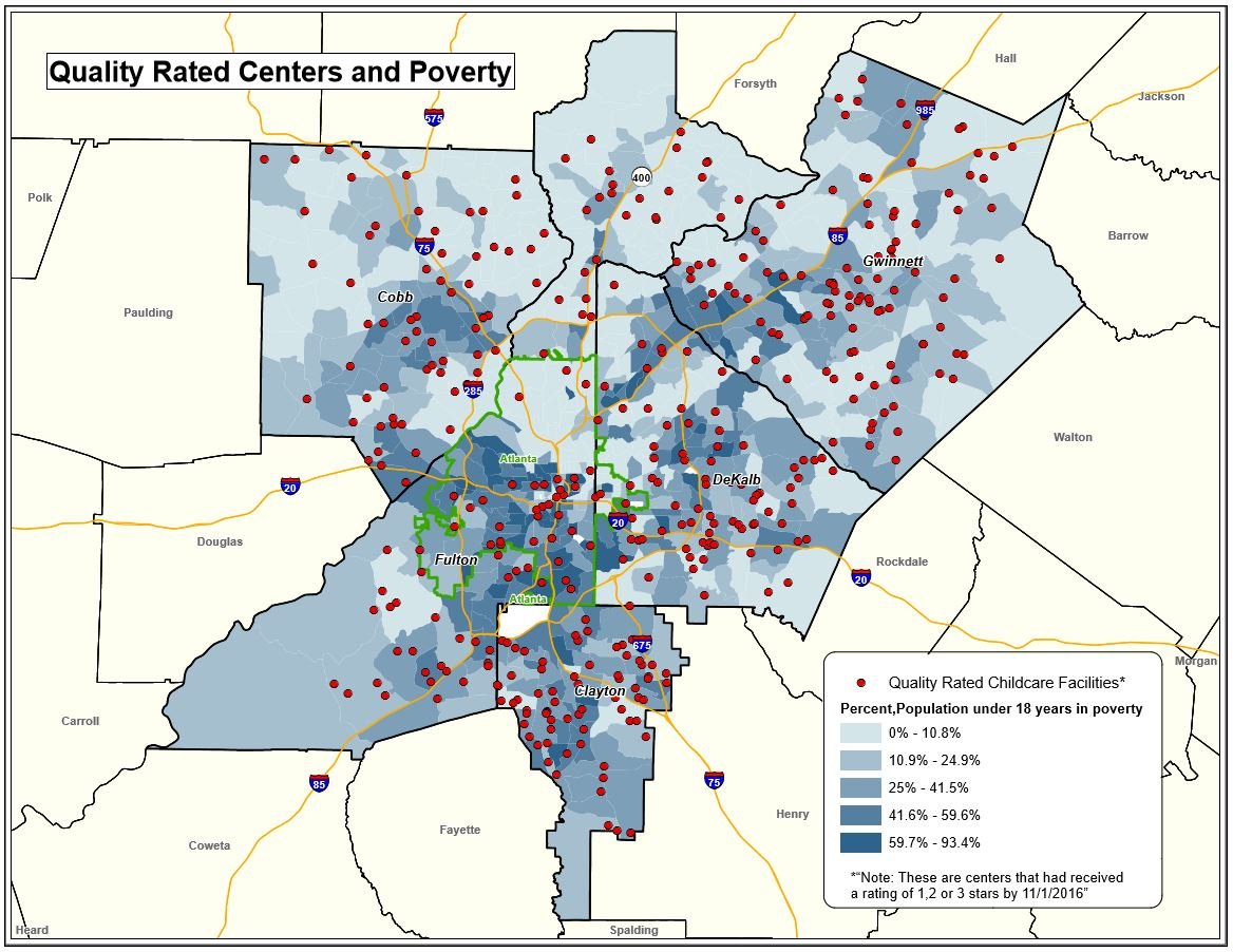
Monday Mapday: Measuring Kindergarten Readiness
Kindergarten readiness is closely linked to future academic achievement and life success. Research shows that children who have access to quality early education programs, or Pre-Kindergarten, develop cognitive, social and behavioral skills necessary for [...]

Monday Mapday: 2016 High School Graduation Rates
This map shows the range of 2016 high school graduation rates for schools in the five core counties and their city school districts. To view an interactive map and view other school-level variables, check [...]

Monday Mapday: Wage Changes 2012-2016
When compared to the top U.S. metros, Atlanta records one of the largest positive changes in average hourly earnings since 2012, increasing by 2.8 percent. Hourly earnings have increased by about $0.70 (in constant [...]

Monday Mapday: Georgia House Districts + Health Insurance
With today being the start of Georgia's 2017 Legislative Session, let's take a quick look at one topic that is sure to be discussed- health insurance. In Georgia, 13.9% of people do not have [...]

Monday Mapday: Income Divide
Using new U.S. Census Bureau data (2011-2015 American Community Survey via Neighborhood Nexus), this map shows the top 20% of neighborhoods with the highest median household incomes (orange) and the 20% with the lowest [...]