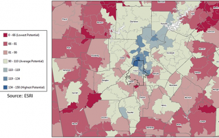
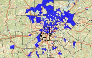
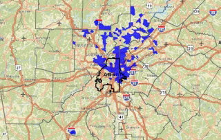
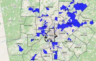
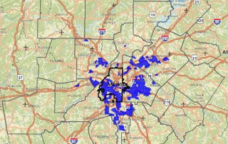
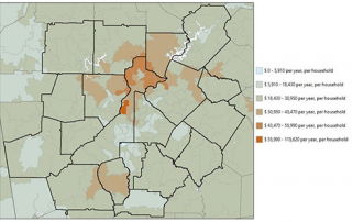
Monday Mapday: Middle-Income Households

The median household income in metro Atlanta is $56,166. The green areas show census tracts with higher rates of middle-income households - those households with an income of $46,166 - $66,166. A clear pattern is that middle-income households are concentrated in the outskirts of the region.

By |2016-12-08T15:25:28-05:00December 14th, 2015|Economy, Monday Mapday, Other Demographics|0 Comments

Monday Mapday: Veterans in Metro Atlanta

In honor of Veterans Day, this map shows where the most veterans live in metro Atlanta. Between 11-20% of residents in the areas shown in blue are veterans. The greatest concentrations of veterans are in the outermost regions of the metro area, primarily below 1-20.

By |2016-12-08T15:25:28-05:00December 14th, 2015|Monday Mapday, Other Demographics|0 Comments

Monday Mapday: Demand for Exercise Products / Services

This map shows the market potential for exercise products/services based on the number of adults who follow a regular routine. The areas in tan represent an average demand (compared to national demand). The red areas represent lower demand, and the blue areas represent the greatest demand, indicating the highest market potential.

By |2016-12-08T15:25:28-05:00November 2nd, 2015|Monday Mapday, Public Health|0 Comments

Monday Mapday: Small Business Loans

This map highlights an uneven distribution of small business loans, concentrated in the northern region of metro Atlanta. The locations in blue received the greatest number of small business loans in 2014. Investment is distributed in the same areas where major employment centers are located. To make your own maps of small business lending in [...]

By |2016-12-08T15:25:30-05:00October 19th, 2015|Economy, Monday Mapday|0 Comments

Monday Mapday: Mortgage Loans for Purchasing Homes Per Square Mile

The locations in blue had the greatest number of mortgage loans originated for buying homes per square mile in 2014. Most loans were concentrated in the northeastern areas of urban core, extending into northern metro Atlanta through DeKalb, Fulton and Cobb Counties.

By |2016-12-08T15:25:30-05:00October 12th, 2015|Housing, Monday Mapday|0 Comments

Monday Mapday: Change in the Percent of Hispanic Population

In honor of National Hispanic Heritage Month, this map shows the census tracts with the greatest increases in Hispanic population between 2000 and 2010. It highlights the largest changes in Gwinnett, Hall, Cobb and Clayton counties.

By |2016-12-08T15:25:30-05:00October 5th, 2015|Monday Mapday, Race and Diversity|0 Comments

Monday Mapday: Public Assistance through Food Stamps

The areas shown in blue had the greatest increase in individuals receiving food stamps per square mile from 2010-2014 in metro Atlanta. While poverty is still concentrated in the urban core, suburban areas unaccustomed to poverty have seen some of the highest spikes in food stamp usage, particularly in the Marietta and Norcross areas. [...]

By |2016-12-08T15:25:30-05:00September 28th, 2015|Economy, Monday Mapday|0 Comments

Monday Mapday: Riding Solo

The heaviest concentrations of commuters driving alone come from outside the urban core. It appears that the highest rates of commuting solo come from the larger more rural counties along the exurban fringe, such as Bartow, Walton, Newton, Coweta and Carroll counties. As expected, the lowest  rates are in the City of Atlanta where commuters [...]

By |2016-12-08T15:25:31-05:00September 21st, 2015|Monday Mapday, Transportation|0 Comments
Go to Top