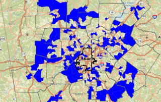
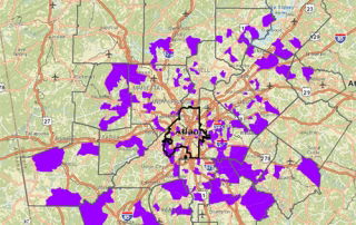
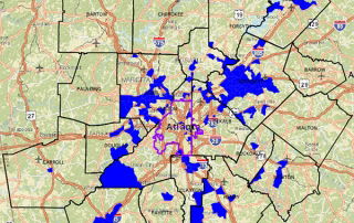
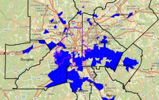
Monday Mapday: Change in Family Composition: 1970-2010

This map comes from September's Regional Snapshot and highlights the areas most affected by the changing family structures. The areas highlighted in blue are those that flipped from very light concentrations of single-parent families in 1970 (20% or less) to very heavy concentrations of single-parent families in 2010 (50% or more).

By |2016-12-08T15:25:31-05:00September 14th, 2015|Monday Mapday, Other Demographics|0 Comments

Monday Mapday: As the Stork Flies

These maps isolate those census tracts where the Stork has been the busiest. The first map shows the total number of births between 2009 and 2013. These are concentrated mostly in exurban areas where the tracts are pretty big. The second map shows the number of births per square mile between 2009 and 2013. This paints a [...]

By |2016-12-08T15:25:31-05:00September 7th, 2015|Age and Generations, Monday Mapday|0 Comments

Monday Mapday: Low-income jobs and low-income workers

These two maps show another challenge that low-income workers typically have - access to jobs. The first map shows the greatest concentrations of low-income jobs - those paying less than $15,000 annually. These jobs are scattered throughout the region. The second map shows where workers who make less than $15,000 annually live. These workers are [...]

By |2016-12-08T15:25:31-05:00August 31st, 2015|Economy, Monday Mapday|0 Comments
Go to Top