COVID-19 weekly reader: May 29, 2020
A look at data describing the effects of COVID-19 on Metro Atlanta.

A look at data describing the effects of COVID-19 on Metro Atlanta.
Many of us have been home a lot lately--not necessarily home alone, but home--with the obvious goal of slowing the spread of COVID-19. How much have our movement patterns changed, and where and when did those patterns change the most? Check out a multi-featured dashboard for some custom insights.
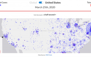
As the USA tries to slow the spread of COVID-19 with social distancing and other measures, it's instructive and sobering to review the extent and rapidity of the coronavirus's spread across the world, the country, and the state of GA. These interactive maps provide data visualizations to track the pandemic.
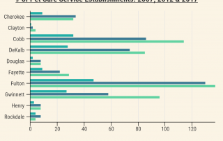
Just how much are we investing in our pets? This post takes a look at current household spending and pet service sector growth between 2007 and 2017.
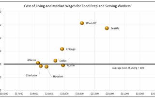
An examination of wage trends in low-wage jobs in Metro Atlanta, with comparisons to peer metros and cost of living.
An overview of how ischemic heart and vascular disease — the state's No. 1 killer — affects Atlantans today and how its impact has changed over time.
Take a look at how labor force participation rates among different age groups today compare to the year 2000 as well as how representation of different age groups in the workforce has changed over time.
An overview of average household spending on recreation and fitness equipment in ARC's 10-county area.
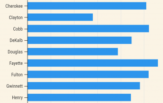
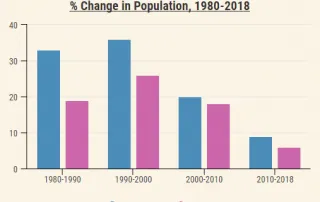
Examining population change in the 10-county area since 1980, including absolute population change, percent change and changes in density.
A look at how differences in income are related to differences in our opinions and beliefs about life in Atlanta, with a focus on housing affordability and workforce development.