Labor Force Participation by Gender and Age
A look at non-pandemic differences in men's and women's labor force participation by age grouping, with a look at long-term career and earnings implications.

A look at non-pandemic differences in men's and women's labor force participation by age grouping, with a look at long-term career and earnings implications.
Looking at how our Case-Shiller Hone Price Index value has changed since our pre-2008 recession peak (hint: it's higher), and how that change compares to other metros around the country.
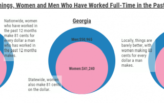
A look at women's earnings as a percent of men's, using 2015-2019 American Community Survey rolling averages.
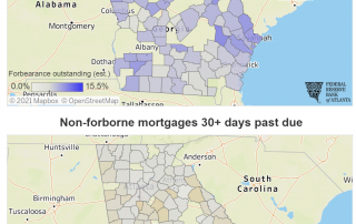
A quick look at what we learned using the Atlanta Fed's Mortgage Analytics and Performance Dashboard.
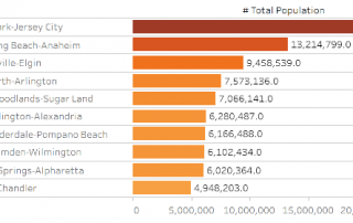
Population Insights from the 100 Metros Dashboard.
A new U.S. Census mapping product examines the percent difference in state tax revenue streams between 2019 and 2020.
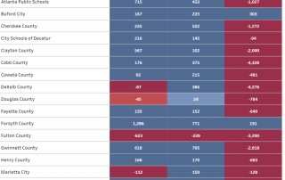
A dashboard of school enrollment shows that most metro school districts have seen a drop in numbers.
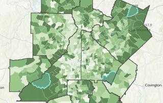
Perhaps better titled "Where will Santa be stressed?" Some maps showing population numbers of children age 9 and younger, where Santa's gonna be working double time to execute his all-important annual job.
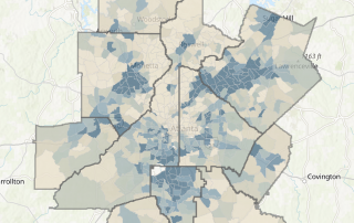
How have rates of the uninsured changed over time? A look at differences between 2010, 2015 and 2019, with a small area map showing which Census tracts see the greatest rate of uninsured residents.
A dashboard comparing initial unemployment insurance claims to job postings in the Atlanta MSA.